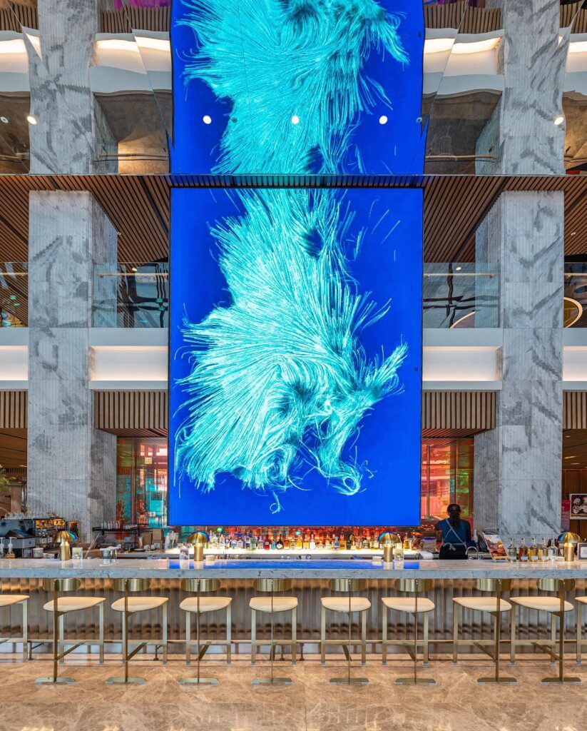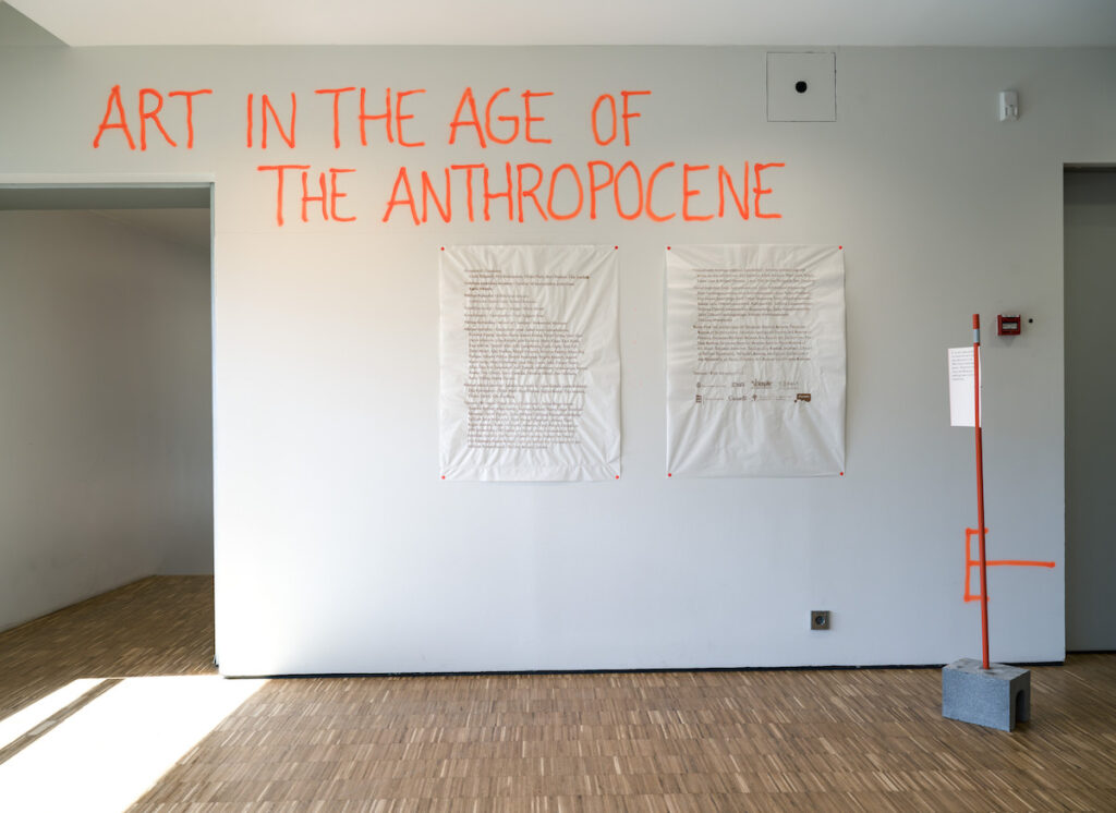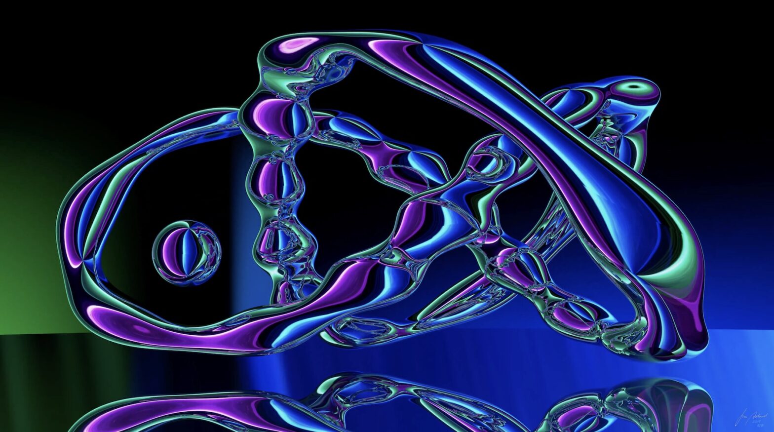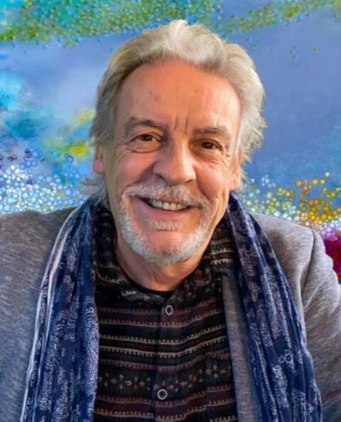
Dev Harlan is a New York-based artist whose work in sculpture, installation, and digital media explores the interplay between technology, nature, and the impact of human activity on our planet. His practice delves into themes such as landscape, anthropogenic change, and technological consumption, prompting viewers to question the often-assumed separation between human societies and the natural world. Harlan’s work invites audiences to see technology as embedded within, and inseparable from, the environment rather than as an external force.
Harlan’s work has been exhibited across the United States and internationally, with solo exhibitions in New York at the Christopher Henry Gallery and Gallery Madison Park. He has been included in international group shows such as “Noor” at the Sharjah Art Museum, the New Museum’s “Ideas City” in New York, and the Singapore Light Art Festival. Recognized for his contributions to digital media arts, Harlan was a 2020 NYFA Fellowship Finalist and won a 2022 Mozaik Artist Grant. His work is included in the permanent collections of corporate and private collectors, underscoring his impact and appeal.
Dev Harlan has launched on Niio his most recent series of artworks, Speculative Cores, which offer a compelling visual metaphor of the effects of our consumerist society on the environment. In this interview, he elaborates on the concepts and the processes behind his work.
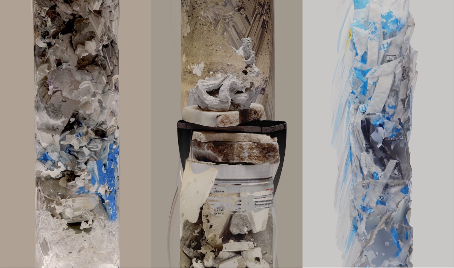
Dev Harlan. Speculative Cores (Internet of Bubble Mailers), 2024
This new series explores the impact of our consumerist society on our planet, made evident in the growing amounts of waste that we are producing. It is obviously connected to your previous work exploring geology and terraformation. Can you elaborate on the connections between your previous work and this series?
Much of my work has a geological theme motivated by travels and residencies in the desert, and more recently my continuing education in Earth Science. When studying the landscape it is difficult to ignore the effects of anthropogenic change. The most obvious in the desert being strip mines, of which I have visited many. These are inextricably linked to technology –every single electronic device, battery or screen contains elements that must be extracted from the Earth.
In my previous moving image artworks I have worked with this theme of global resource extraction and the myth of limitless consumption through the juxtaposition of landscape elements and technological debris. This new work “Speculative Cores” is just one step adjacent where I am expressing this theme through the language of geoscience, specifically the well known form of the geological core sample. Technology is seen buried in stratigraphic layers with the rocks and minerals of which it is made.
The artworks present a series of 3D-scanned elements including sand and stone, as well as plastics and e-waste. Can you describe the process of creation?
In some ways this begins from a habit of collecting things. I have boxes of jars and bottles containing sand samples I have collected from all over the world, wherever I travel. Rocks also. I also have accumulations of electronic junk in the studio, and sometimes collect more from recycling centers and the vast amounts of waste left on sidewalks and loading docks throughout NYC.
In my process of 3D scanning artworks in the studio I began mixing materials–studies or works in progress with sand and rocks and broken electronics. For the core samples series I layer all these diverse materials in a large acrylic cylinder and create a scan of the cylinder. The scans are then further combined and composed with each other using digital tools.
Composing these 3D scans as cylinders that evoke geological core samples gives a powerful message, suggesting that all this trash and debris will remain on our planet long after our present time. Do you think that viewers will grasp the meaning of the core sample as a testimony of a process of centuries, or millenia?
Certainly that is the intention, and indeed many of the proposed definitions of the Anthropocene epoch attempt to define a specific place in the geological record where humans have already left indelible traces, such as increased CO2 concentrations in stone, or radioactive particles from nuclear weapons testing.
I see many artists examining this form of the core cylinder, in what has been termed the ‘geological turn’, as it is a widely recognized shorthand for our ability to understand Earth history through the geosciences. In a real sense a core can be considered a dataset that records hundreds of thousands or even millions of years. But so also is the side of a mountain. Our landfills will one day be parts of mountains, with cell phones, cars, bricks and diapers. We may ask with seriousness, is that the record we wish to leave behind?
Dev Harlan. Speculative Cores (Alabaster Quickcam), 2024
Besides the conceptual aspect of putting these elements together, there is a clear attention to aesthetics, as is also evidenced in your previous series Hegemony of Screensavers. Which aesthetic decisions influenced the making of these compositions?
The photogrammetry scanning process comes with a lot of artifacts and unpredictability and there is a tension between wanting to embellish or “improve” the scan versus letting the model be what it is. I think I take a cue here from Hito Steryerl’s “poor image” theory in that leaving the artifacts and distortions in the scanning process helps tell the story of what the artwork is and how it came to be. The model simply rotates through the frame against a solid field to achieve a sort of literalness in presenting a 3D scan as precisely what it is.
At the other end of this tension I do want to add some uncanniness or departure from reality, as the artwork is still only a facsimile of the real. The trailing after image I use a lot also has a sort of literalness to it – the incremental temporality of time base art. It also provides emergent aesthetic properties and a sort of elegance in pattern and form that I find satisfying. Part of the strategy is to draw in a viewer’s attention with an aesthetic appeal which, on closer inspection, may communicate a more difficult story about the entanglement of nature and technological civilizations.
Dev Harlan. Speculative Cores (Salt Lake Slab), 2024
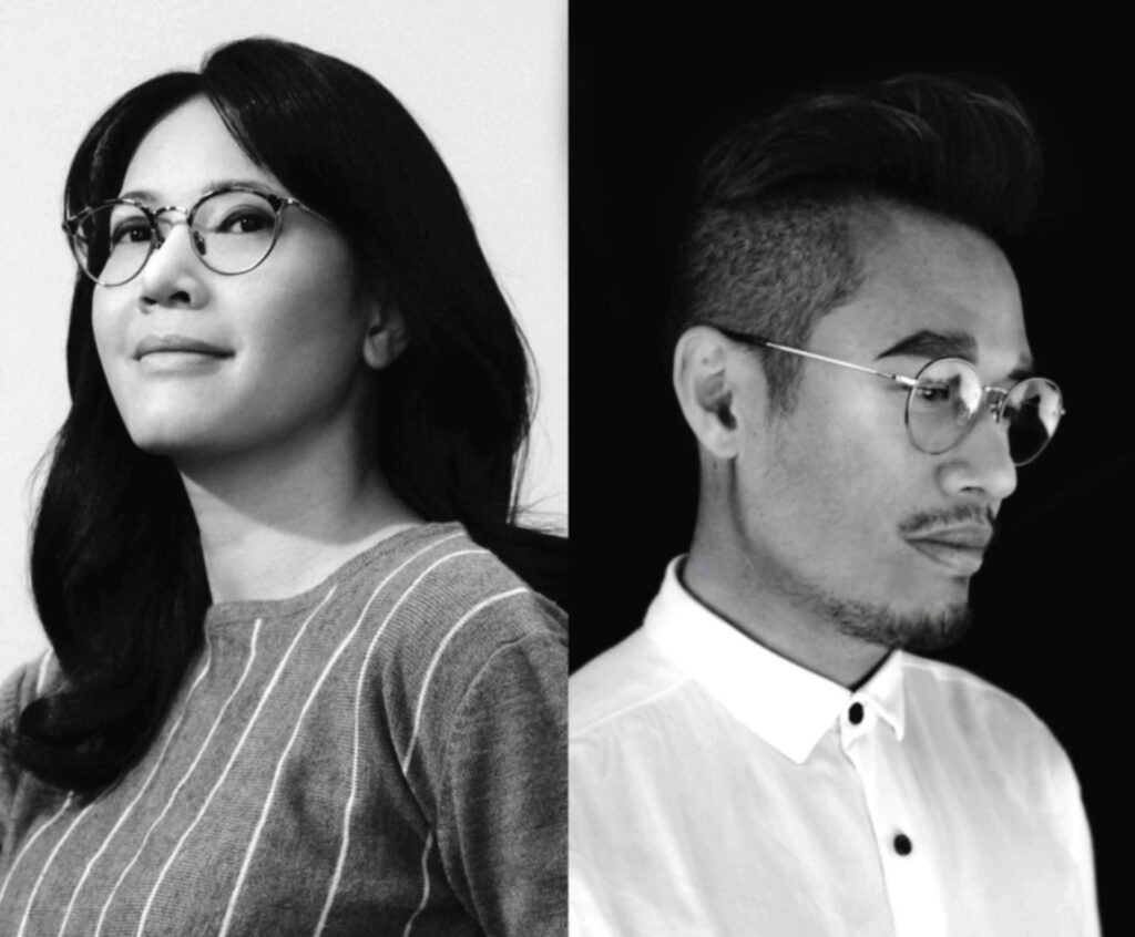
The creative duo Moonwalker (Dany Vo and Vy Vo) has its roots in the worlds of graphic design and illustration, where they honed their skills in creating mesmerizing artistic compositions exploring nature and fashion. Through the technique of digital collage, the artists generate fantastic worlds populated by flowers, plants, and human beings in idyllic harmony. Infused with gracile movements, their compositions are visually seductive and deeply inspiring, as is demonstrated by their growing number of followers and the interest in their work, which is expanding widely around the globe.
Niio is proud to present a selection of their work focused on nature and inspired by their personal experience with plants and flowers. The artcast Floral Propagationcollects several pieces created with AI models, while a series ofcatalogsoffer selected limited editions to art collectors. In the following interview, the artists elaborate on the concepts and motivations behind their work.
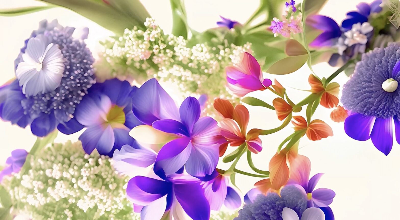
Moonwalker. Vivid Petals Collection #3, 2024
As illustrators and graphic designers, you have a keen sense of aesthetics and an instinct to create alluring visual compositions. This is apparent in your artistic work, which denotes a conscious selection of color palettes and use of balance and symmetry. How important is this compositional aspect of your work?
We prioritize creating visually compelling compositions with strong contrasts, bold shapes, and carefully selected color palettes. In today’s saturated digital landscape, we aim for instant impact—artwork that prompts viewers to pause and engage deeply. Despite our maximalist appearance, our principle of “less is more” guides us in every element choice, ensuring each detail serves a purpose. This compositional approach not only defines our visual style but also influences our subject matter selection, allowing us to effectively convey narratives and evoke emotions that resonate profoundly with our audience.
You work with digital collage, in a way that is very much in line with a visual culture saturated with images. Would you say that nowadays it only makes sense to create a new image by appropriating existing content? And when you create your own libraries, do you elaborate an internal logic for the use of these elements, to develop your own visual vocabulary?
Our approach to digital collage began with a fascination for historical botanical drawings, which often go underappreciated in today’s visual culture despite their rich detail and historical significance. These assets, now freely accessible, sparked our desire to reinterpret them through animated digital art, bridging the gap between traditional artistry and modern visual expressions. As we developed our own libraries of visual elements, including more than just botanical illustrations, we established an internal logic to guide their integration. This process has evolved organically into a collage style, shaped through continuous experimentation and refinement. Each element is carefully chosen to contribute to our unique visual vocabulary, ensuring that every composition tells a compelling visual story.
Moonwalker. In Bloom Collection #2, 2024
Your work deals with visions of nature. Currently most of us live in urban environments surrounded by domesticated forms of nature: trees bordering the sidewalks, parks designed for our leisure, pot plants at home. Is the representation of nature through art another form of domestication? Why do you think that we are so moved by the representation of nature?
The domesticated forms of nature that surround us in urban environments serve as essential sanctuaries for contemplation and connection. Through our art, we aim to capture and convey the profound bond we feel with nature—the way it enables us to reconnect with our true selves and harmonize our inner and outer worlds. Our artworks are a manifestation of this bond, translated into visual elements that we are privileged to share with others. We believe that representations of nature in art resonate deeply because they evoke this universal longing for connection and renewal. By exploring and interpreting nature through our creative lens, we hope to move our audience as profoundly as we ourselves are moved by the beauty and tranquility of the natural world.
Moonwalker. Vivid Petals Collection #4, 2024
Given your personal experience in caring for plants, how do you think this love for the natural environment can be communicated through your work?
We bring a similar love for nature into our artwork. Like plant enthusiasts, we select flowers with interesting forms and colors. This careful curation is central to our creative process, where we combine these elements into harmonious compositions. Occasionally, we create unique, imaginary flowers, always rooted in our methodical approach. Animation adds depth to our work, enriching the visual storytelling of our pieces.
Moonwalker. In Bloom Collection #1, 2024
In the series presented on Niio, the animations depict different species of flowers that have been created through AI-assisted digital collage. The digital medium allows you to create anything you can imagine, and while the compositions are quite spectacular, the flowers seem mostly realistic. Why did you choose to retain this level of realism instead of creating purely fantastical plants?
Artificial Intelligence is indeed integral to our creative process, but we approach its use with a specific vision in mind. While AI allows us to explore limitless possibilities in digital collage, our goal isn’t to create purely fantastical plants. Instead, we harness AI to achieve a balance: realistic blooming flowers that resonate authentically with viewers. This realism is essential because it aligns with our artistic intent to capture the beauty of natural blooms, akin to what we might capture in real-life footage. Creating such footage would typically demand extensive time, resources, and effort that are not always feasible for us. Therefore, AI serves as a tool to manifest our artistic vision effectively, ensuring our animations evoke a genuine connection with the natural world.
Moonwalker. Vivid Petals Collection #1, 2024
AI programs provide immense possibilities of creation to artists, yet they tend to generate similar aesthetics, as it has been made apparent with the progression from the algorithmic pareidolia of Google’s DeepDream to the blurry “paintings” created with GANs and now the morphing animations made possible by current AI models. As artists, how do you find your visual style and aesthetics within these ongoing trends?
Our focus is on depicting nature authentically, rather than following AI trends. While AI offers many creative possibilities, we prefer to use it as a tool to enhance our vision, not dictate it. We find inspiration in discovering new flowers and natural beauty, aiming to create artworks that are unique to our own style and perspective.
Your work also connects with the world of fashion. What do you find most interesting about fashion as a creative field and a material for your artistic creations? Since both the representation of nature and the human body are visually very attractive, how do these two elements compete in your creations? Fashion inspires us for its creative blend of innovation and aesthetic expression. The Dutch fashion designer Iris Van Herpen, particularly, deeply influences us with her designs that intertwine with nature. In our art, we see nature and the human body not as competing elements but as complementary. Nature offers timeless beauty and intricate details, while the human body provides expressive form and emotion. We integrate these elements to explore themes of identity and connection, creating compositions where botanical motifs and human forms harmoniously interact. This approach invites viewers to reflect on the profound relationship between humanity and the natural world.
This has been an exciting year, in which we faced challenging situations but also achieved great partnerships, made enormous progress in the development of our platform and apps, supported the work of amazing artists and galleries, and brought video and digital art to a rapidly expanding audience. Our hardworking, multitalented, international team is now celebrating the holidays with their families and looking forward to an even more active 2024. We believe that great art has no boundaries, and we work to make it possible for anyone to access quality artworks on any screen, adding to the efforts that so many art professionals do to integrate art into people’s everyday experience.
In this article, we present to you a quick look at what 2023 has been at Niio, with our heartfelt thank you to all the artists, galleries, collectors, curators, and art lovers who share and enjoy art with us.
Renz Renderz, After the Afterparty, 2022
Artcasts: the distributed exhibition
Through our curated virtual exhibitions we have been able to bring art to the screens of art lovers, collectors, galleries, and art institutions internationally, with unparalleled ease and flexibility. This year, we are proud to have launched 42 artcasts featuring the work of outstanding artists, as well as collaborations with galleries, art centers, and universities.
Here are some of our favorite artcasts this year, but you can find many more by browsing the Discover area in our app.
PHANTASMAVERSE
Niio proudly hosted a collaboration with artists and NYU professors Carla Gannis and Snow Yunxue Fu consisting of a group artcast featuring recent works by artists and NYU students Ren Ciarrocchi, Jessica Dai, Marina Roos Guthmann, James Lee, Tinrey Wang, Yuaqing She & June Bee, Shentong Yu, and Jerry Zhao.
In addition to the artcast, we published interviews with the curators and the artists in our Editorial section.
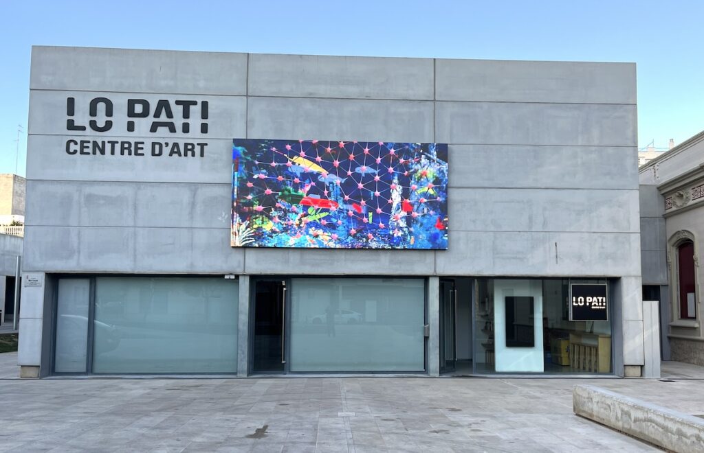
A collaboration between Niio and Mèdol Centre de les Arts Contemporànies in Tarragona has brought digital art to the public space in the Mediterranean city. A curated selection of digital artworks by our Senior Curator Pau Waelder has been presented weekly on a screen at Plaça del Fòrum, featuring the work of Serafín Álvarez, Mark Amerika, Gregory Chatonsky, Alix Desaubliaux, Frederik De Wilde, Mihai Grecu, Jonathan Monaghan and Yusuke Shigeta.
A very special project we have been developing this year is a collaboration with the artist Domenico Barra on his exploration of beauty in art and the use of glitch as a means of creative expression. We conceived this project as an artist-in-residence format, in which Barra has configured an artcast as a work-in-progress and regularly published new artworks, alongside documentation and preliminary sketches. The project is ongoing and involves a conversation between the artist and our Senior Curator as a series of articles in our Editorial section.
Chun Hua Catherine Dong. Meet Me Halfway – part 1, 2021
Artists: unbridled talent
Supporting artists is one of the reasons why Niio exists. We created this platform to empower artists allowing them to keep and manage their portfolio, easily and securely sharing their work with art lovers, collectors, galleries, and institutions. We are also actively suggesting their work to our Art in Public program clients, showcasing their latest creations on our Curated Art program, and getting to know them better through conversations that we publish in our Editorial section. This year, we’ve launched more than 30 solo artcasts and a dozen group shows, as well as highlighted 47 selected artworks in our Artwork of the Week showcase on social media. In addition to this, we’ve published 30 interviews with the artists in our curated program, as part of our commitment to let our audience know the creators behind the art.
These are some of the artists we’ve showcased this year. We’d love to include them all here, but you can find them in our Discovery area.
Over the last two decades, the Brussels-based Colombian artist has carried out a consistent body of work in the form of interactive audiovisual installations and live performances. Since 2018, Laura is engaged in a series of artworks exploring the environmental impact of neo-liberal extractivist practices in the Amazon basin.
An award-winning artist whose work is characterized by otherworldly narratives, Jonathan Monaghan introduces in his animations, prints, and sculptures a critical view of our contemporary society that aims at consumerism and our growing dependence on digital technology.
Dong’s artistic practice is based in performance art, photography, video, VR, AR, and 3D printing within the contemporary context of global feminism. Dong’s work deals mainly with cultural intersections created by globalization and asks what it means to be a citizen of the world today.
Paris-based artist Antoine Schmitt describes himself as a “heir of kinetic art and cybernetic art,” aptly indicating the two main aspects of his work: the interest in all processes of movement, and the use of computers to create generative and interactive artworks.
Japanese videographer Yusuke Shigeta (1981) has developed a body of work consisting of screen-based and multimedia installations for art exhibitions and museum shows. A Graduate from the Tokyo Graduate School of Film and New Media, he works in animation and has recently become involved in the NFT market, where he finds an additional channel of distribution for his work.
Collaborating with prominent contemporary art galleries and partnering with high-end business and hospitality properties is a crucial aspect of our mission to bring quality video and digital art to the best spaces and integrate art into people’s everyday life. We are proud to have developed strong ties with leading digital art galleries bitforms (New York), Galerie Charlot (Paris), and DAM Projects (Berlin), as well as with many other professional art galleries, and to provide curated art selections to some of the most prestigious brands and properties, such as Conrad Hotels & Resorts, The Mondrian Hotel Seoul Itaewon, PENN 11 New York, and many others.
Below are some highlights of a very busy year with wonderful collaborations and promising partnerships. You can find more about our activities on our LinkedIn and Instagram accounts.
TALKING GALLERIES
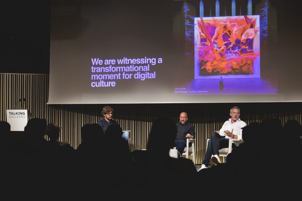
Niio’s co-founder and CEO Rob Anders was invited to the Talking Galleries Symposium in Barcelona this year. The prestigious gathering of the most prominent contemporary art galleries celebrated a special edition dedicated to digital art and featured talks by outstanding guests Steven Sacks, founder of bitforms, Valerie Hasson-Benillouche, founder of Galerie Charlot, Wolf Lieser, founder of DAM Projects, and David Gryn, founder of DAATA. Our Senior Curator Pau Waelder helped shape the symposium’s program and moderated several talks.
REFIK ANADOL PRESENTED BY BITFORMS AT ART SG
Niio collaborated with bitforms in the gallery’s presentation of the latest artworks by Refik Anadol at the Art SG contemporary art fair in Singapore. The collaboration, following a model that we are recurrently adopting with galleries, consisted in extending the presentation of the artworks at the art fair with a limited-time artcast and the publication of an extensive article about Anadol’s work in our Editorial section.
CONRAD NEW YORK MIDTOWN HOTEL
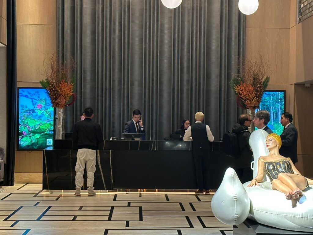
Initiating a partnership with Conrad Hotels & Resorts, a curated selection of artworks provided by Niio is being displayed at the reception and guest room’s screens of the Conrad New York Midtown Hotel. This stylish luxury hotel offers guests and unparalleled experience in the city which is now enhanced by the presence of selected artworks by acclaimed artists Eelco Brand, Daniel Canogar, and Antoine Schmitt.
Articles: a space for reflection
The section you are now reading contributes to the backbone of Niio’s activities by providing a space of documentation, reflection, and exchange with artists, gallerists, and art professionals, as well as a source of information and discussion around key themes of contemporary art. This year, the way AI is shaping artistic creativity, as well as the role of art institutions in creating a more sustainable art world were some of the main issues we addressed.
Read some of our most commented articles this year and find many more by browsing our Editorial section.
Stan Adard, a graduate in social psychology and an educator, has long recognized the significance of breath in stress reduction. This insight, combined with years of meditation experience, has been a guiding force in Adard’s career, spanning over three decades as the owner and CEO of various IT companies. Adard’s passion lies at the intersection of humanity and technology, a fascination tracing back to the early days of computer innovation. Committed to exploring the use of art as a mindfulness tool, Adard employs a unique 4-dimensional digital brush, where time represents the fourth dimension, infusing his pictures and experimental art films with a palpable sense of breath and flow.
Practice conscious breathing with Stan Adard’s Breathing Pictures.
Stan Adard. The Breathing Pictures: Sky Dance, 2017
As a professional of the software industry and social psychologist, what is your opinion on the way digital media influence our mental health?
To form an opinion, I need data and details. Digital media is an extremely broad term, and I don’t want to join those who mainly lament the dark side of new media. From the YouTube help videos created by hundreds of creators with loving intent to news and social media networks where digital content often creates a breathless atmosphere. In addition to these, just as examples of the many layers in the digital media landscape, there’s the entire digital advertising world that inundates us from practically every device. Or digital art, which can either unsettle, bore, or inspire us.
We experience daily the challenges of not simply being swept away by this flood of possibilities. Where do we direct our attention? It’s our decision which aspects of digital media empower us and which weaken us. This process of realization is not always easy, as we often don’t immediately sense whether something is beneficial or weakens us in the long run. The world is becoming more complex and is already overwhelming us in many aspects. That’s why it’s important to find an inner path, an inner anchor. Conscious breathing is a crucial key to this. And if I can do this in the form of digital breath images, it helps in using digital media productively.
You have stated that fear and anxiety are often consciously used to manipulate people. Could your work be seen, thus, as being not only about mindfulness but also social change?
You’ve caught me there. I see how our world is trapped in a system based on fear. As a system architect for over three decades, I have an eye for systems. And the overall system that towers over the national and alliance subsystems of the entire world serves only one purpose: to channel the profits from this planet’s resources and the labor of every inhabitant upwards. Into the hands of a few. This happens with a ruthlessness that sends shivers down my spine. The hunger in the world, the senseless wars, the acts of terror in the name of some selfinvented, vengeful god. The fuel is fear. In my view, fear is the opposite of love. Hatred stems from fear. What I can do in my smallness against this machinery is to bring to light that conscious breathing helps us so that our thoughts, and therefore our fears, can no longer control us. It’s an illusion to think that we can control our thoughts. But we can learn not to be controlled by our thoughts anymore. The breathing images, in their simplicity, are a subversive and loving element against a system that needs to be fundamentally renewed. Of course, a single image cannot lead a viewer to Nirvana. But it daily reminds us that it’s time to consider what conscious breathing can achieve at its core.
Stan Adard. The Breathing Pictures: Breathing Luxury, 2017
Let’s talk about the artworks we are now showcasing on Niio. Can you elaborate on the differences between the breathing pictures and the flowing pictures?
Most of my breathing pictures come to life during a process where I create my next breathing film. My digital experimental films must flow and breathe. Sometimes, an endlessly flowing motion arises from the film’s context, into which I then, at times, insert a breathing structure or infuse the structure itself with a breathing motion. ‘Eternal Blue’ is such an example. The viewer needs to take a moment to tune into the image until they discover the breathing motion.
In terms of their appearance, these artworks are often characterized by the presence of shiny, reflective objects and neon colors. Is this a personal aesthetic decision or does it respond to meditation purposes?
The ‘neon colors’ are generated by a graphics card in my server. In 2019, I was invited to create a breathing picture for an eSports gaming event in Asia (over Niio). To visually capture the attention of the mostly young participants, I used colors they are well acquainted with from their gaming servers.
Using the same colors, I then created a small series of pictures. However, in general, I choose colors based on aesthetic aspects. Colors have to appeal to me so that I can spend a month working with them, which is the average time it takes to create a new image. As an educated social psychologist, I am well aware of colors and their perception, but I rely on my intuition and often chance to choose the colors.
Your signature is present in the lower right corner of each artwork. Does this mean that you conceive them as a painting? Is it to reinforce their perception as a work of art?
Exactly! A decade ago, my goal was to bridge the gap between classical paintings and digital art. In this vision, digital works would reveal their true, breathing form only when the viewer stands calmly in front of the artwork, allowing them to perceive the subtle breathing movements.
Right from the beginning, the signature, along with the year and edition, was a crucial means in the digital realm of art to precisely locate a work. Each ‘breathing picture’ exists only once as an original, marked with the appropriate signature, and is registered in the blockchain as proof of existence. The same applies to unique NFTs. For streaming platforms, exhibitions, and fairs, I always use an Artist Copy to ensure the integrity of the original work.
Stan Adard. The Breathing Pictures: Clematis Torus, 2018
Usually, a sphere is the element that guides the meditation. Does it have a different purpose according to its movement in the composition? Would you say that certain movements are easier to carry out a guided breathing exercise?
A sphere is a perfect geometric form. Inhaling enlarges the sphere and makes it rise, just like our chest does. Exhaling lowers the focal object and makes it smaller again.
Over the years, I’ve realized that in public spaces, the breathing movement must be clearly visible. People are often in a rush, and if we want to motivate them for a single conscious breath, it needs to be evident that something is breathing. The representation of breath can take many forms, and for each image, I explore the possibilities for it to fulfill its purpose in either a calm setting (gallery, living space) or a more hectic place (art fairs, exhibitions, Times Square).
Tell me about the use of the torus as a recurring shape in your compositions. What do you find most interesting and/or effective in terms of guiding the viewer’s attention in this shape?
A torus symbolizes infinity for me. I also enjoy twisting a torus, forming a lemniscate, or adding gentle extensions to it. The eye can then glide along the structures of this ever-circular body, capturing the details. Ultimately, we reach a point where we perceive the structure as a whole and then also see that it breathes.
You have mentioned influences from Buddhist art and architecture such as the Wat Rong Seur Ten (blue temple) in Chiang Rai. Which other sites or works of art have inspired your work?
I’ve been practicing Buddhist meditation for decades, so visiting various temples on a tour through Thailand was a natural choice. A photo of the Blue Buddha, with blue being a color I often use in my works, stayed with me after my return to Europe. This inspiration led me to create three works in total: ‘Blue Buddha’ as a breathing image, ‘Blue Buddha Meditation’ with a soundscape by my longtime musician friend Mihaly Horvath, and a Virtual Reality version of ‘Blue Buddha Meditation.’
The breathing experimental short film ‘Time(s) to Breathe’ was inspired by Times Square in NYC, but these are exceptions. My primary source of inspiration is nature itself.
Stan Adard. The Breathing Pictures: Ethernal Blue, 2019
There are subtle references to nature in many of your artworks, can you tell us about this connection to the natural environment?
We discussed systems earlier. Nature, where humans are a part of, is the most complex and wonderful system we know. Its forms, colors, creativity, everchanging behavior, inter-connectivity, forces, and inner structures are all miracles rooted in the quantum fields that fill our universe. Sometimes, it leaves me breathless when I attempt to comprehend even a tiny fraction of it. At such moments, it’s time to create a new breathing picture, do some garden work, or to make concepts about the next experimental art film.
Some of your works display a mesmerizing, cyclical movement, while others reveal very subtle, almost imperceptible changes. How do you decide on the type of movement that each artwork will display?
Well, that depends on the environment in which I see the artwork being used. Initially, I primarily created breathing pictures with a slow and almost imperceptible breathing motion. The idea behind it was that only those who are calm would take the time to observe the image and perceive the breathing movement. These images only breathe 3-4 times per minute, while in everyday life, we may breathe 10-12 times per minute. The movement should not distract and should resemble a painting.
For art fairs, exhibitions, and ultimately the presence of the breathing pictures in very vibrant settings, I made the breathing movement more apparent. Spheres expanding and moving are easier and quicker to read. Moreover, based on many observations, I’ve found it more helpful to draw people’s attention to their breathing patterns when the initial breath rate is higher, perhaps around eight to ten breaths per minute, gradually slowing down over time. Such setups resemble therefore more to a meditative session.
You were a musician at the progressive rock band Nautilus, yet music does not seem to play a central role in these artworks (although there is a sense of rhythm). Why is that?
Music still plays a significant role in my works, albeit not in The Breathing Pictures. Perhaps this perception arises from platforms like Niio, where I primarily showcase breathing pictures that are meant to fill the large black voids, often referred to as inactive screens, with art. However, I also create experimental breathing short films. ‘Time(s) to Breathe’ and the VR short film ‘Breathing Through’ feature carefully crafted soundscapes composed and realized by my musician friend, Mihaly Horvath.
Furthermore, we (astradream) collaborate in workshops and exhibitions with various sequences of The Breathing Pictures, accompanied by a carefully drafted soundscape, creating what we call a ‘Breathing Space.’
You have created a series of artworks in collaboration with several artists, such as Magno Laracuente, Zmakey, and Maura Patrizia Zoller. How have these collaborations developed? Which is your approach to incorporating their paintings into your digital animations?
I love working with people and in teams. All the artists I mentioned earlier, including the recent addition of Margarita Somnolet, have come into my life through art exhibitions. There must be something in the structure or movement of a painting that challenges me to find an additional layer that gives rise to a breathing motion. Sometimes, I carry a painting in a corner of my brain for a year, searching for the right approach that does justice to the image. My artist friends see it as an opportunity to expand their viewership.
For me, it’s the connection with various artists, their perspectives on the world, and the diverse life circumstances they come from that contribute to my creativity. These connections have also resulted in some wonderful friendships.
Stan Adard. The Breathing Pictures: Ethernal Blue, 2019
You have experimented with VR, how would you compare this immersive medium with your digital paintings in terms of the conception of the artwork and the viewer’s experience?
A classic painting is like a view from a window. Everything that doesn’t fit within the window frame is omitted and remains unseen. Creating a film or artwork in a virtual environment is the construction of an entire world. In this realm, you can’t hide a camera; what’s behind or beneath you is as significant as what’s in front of or above you. Crafting a virtual concept requires strategic thinking in concentric layers, perhaps similar to building an onion. A virtual space structurally resembles a sphere, which we perceive from the inside. This sphere must be developed in all directions.
We’ve also experimented with immersive audio, and the two VR works available today, ‘Breathing Through’ and ‘Blue Buddha Meditation VR,’ are quite impressive. I look forward to Niio delivering VR content to its subscribers in the future. In a virtual environment, the viewer can immerse themselves in the artwork; art can’t get much more comprehensive than that.
I think that I’m a fan of this art form?
You have had a long relationship with media during your life, from your first Super8 camera and a Hammond electronic organ to the current 3D animation and VR software. From that perspective, how do you expect digital media to evolve in the near future? Will it continue to bring constant, groundbreaking innovation, will it stagnate…?
Wow, that’s a vast field for predictions. The developments in the realm of artificial intelligence are currently pushing the boundaries of our comprehension. So, let’s focus on films and art for now. From my perspective, humans are inherently curious beings, and they age best when they remain open and curious. This nature won’t let humanity rest until it improves its film techniques, which naturally include the depiction of virtual realities, to the point where there are no discernible differences between the real world and the depicted world. Only when we can’t distinguish resolution, ambient sounds, music, and eventually even scent from reality while watching a movie or using our VR goggles, will this development, which has entered an exponential phase, come to a halt. So, it’s only when we can’t tell whether the actors in a film are real people or animated characters that the developers of these technologies can finally sit back. In the near future, we will certainly see more 16K (for both eyes), larger devices, more VR entertainment, and new ideas in the realm of digital art. The race for the world’s largest display recently gained momentum with the Sphere in Las Vegas.
As public advertising spaces are increasingly rejected by many communities, it will become more crucial to produce meaningful content for these spaces. I look forward to being a small part of shaping this landscape.
This article is the first of a series about the symbolism of colors based on the writings of historian Michel Pastoreau. According to Pastoreau, in terms of their symbolism and adoption by human societies, we can only speak of six colors: blue, red, white, yellow, green, and black. Taking inspiration from his texts, we have curated six artcasts that show how artists use these colors in their work and exemplify the ways in which they are incorporated into digital art.
We invite you to learn more about the symbolic connotations of each color and experience the artworks on your own screen.
Blue is the color that makes the perfect background. It doesn’t stand out, it is calming and invites consensus. Large organizations choose blue to denote sobriety and group consensus, as can be seen in the flags of the United Nations and the European Union. It is the color of the sea and the sky: a peaceful, quiet, conservative color. Pastoreau states: “since about 1890, blue became the prominent color in Western societies, as much in France as in Sicily, in the United States and New Zealand […] In other cultures something different happens: most Japanese, for instance, prefer black.”
However, blue has not always had these connotations. In ancient Rome, it was the color of the barbarians, the foreigners. There wasn’t a name for blue, which had to be borrowed from the Germanic blau or the Arabic azraq. In the 12th and 13th centuries, blue gained popularity in Europe thanks to the cult of the Virgin Mary, and was later adopted by royal families. In the 16th century, the Reformation promoted the idea that certain colors were more decent than others: black, grey, and blue became associated with correctness and adopted in masculine garments.
The invention of Prussian blue in 1720 popularized darker tones that were quickly adopted by Romantic painters and poets. In 1850, the Jewish tailor Levi-Strauss invented jeans, an indigo-colored trousers which introduced blue to the workspace, and later became associated with leisure, in the 1930s, and even a sign of a rebellious attitude, in the 1960s. Nowadays, blue is mostly perceived as a calm, conservative color, particularly in politics, as a reaction to the prominence of red in the communist regimes of the Soviet Union and China.
Patrick Tresset. Scene 11, Human Study #1, Hong Kong series, 2022
In the realm of the digital image, blue has acquired very different connotations: it can be electric, vibrant, an outlandish blue that can only exist in the virtual world. In 1993, Mosaic, one of the first web browsers, introduced blue hyperlinks to differentiate clickable text in addition to underscoring, which Tim Berners-Lee had introduced in his first browser in 1987. Standing out on the white, light gray, and yellow backgrounds of early browsers, blue became the color of the Internet in the 1990s. It has since been routinely adopted by tech companies, both for its association with electricity and machinery as for its dual conservative and rebellious symbolism. Leading social media platforms Facebook, Twitter, and LinkedIn use blue in their logos, denoting seriousness, consensus, and stability (although these words do not particularly apply to the current state of platforms such as Twitter). Blue has become the color of online communities, and even alternative channels such as Discord, Signal, or Telegram all use blue in their brands.
The chroma key compositing technique used in film to combine two or more elements recorded separately initially used black or white backgrounds, until in the 1930s RKO Radio Pictures introduced the blue screen method. The Thief of Bagdad (1940), which won the Academy Award for Best Special Effects, was the first film to use this technique. Blue has since been used, alongside green, as a background in film sets, and therefore associated with visual effects, and particularly science fiction blockbuster films such as Star Wars.
The popularization of cyberpunk, a literary genre that responds to the utopian science fiction stories of the 1950s, brought a darker shade of blue to our visions of the future. Ridley Scott’s 1982 film Blade Runner, an adaptation of Philip K. Dick’s novel Do Androids Dream of Electric Sheep? (1968), pictured a dystopian future in a dark and rainy city of Los Angeles dominated by immense screens and neon lights. In William Gibson’s Neuromancer (1984), the sky is blue gray, “the color of television, tuned to a dead channel.” Blue has thus been associated with technology, science fiction, and virtual worlds since the 1980s and 1990s. It was partly replaced by the popularity of phosphor green, associated with hacker culture and popularized by films such as The Matrix trilogy (1999-2003), but was brought back by a wave of 1990s nostalgia exemplified in the work of Post-Internet artists in the early 2010s.
Alix Desaubliaux. Alexandra Erlich-Speiser, 2021
Nowadays, blue is used in digital art in the same way as in painting, to denote melancholy or to represent a blue sky or a calm sea, but also as a distinct color of virtual worlds and to symbolize artificiality. Blue continues to be a conformist, calm color, but in our digital society it has also become associated with connectivity, ubiquity, and community.
We tend to think of screens as a wide rectangle, resting on a TV stand or hung on the wall, as a smaller version of the cinema screen or an upgraded version of the traditional landscape painting that decorated most homes, usually above the sofa. However, the landscape orientation screen, with its wide 16:9 aspect ratio, is a rather recent industry standard.
Manufacturers started producing 16:9 screens in the early 2000s, switching from the 4:3 aspect ratio that was common in most TV sets, following the growing popularity of high-definition television and widescreen content. Computers, laptops, and smartphones have adopted this standard aspect ratio, and later on, given the way we hold a smartphone in our hand, these devices have popularized portrait orientation content that is now ubiquitous on social media.
One might be quick to think that portrait screens are a result of the popularity of Instagram Stories and Tik Tok videos. In fact, when in 2020 Samsung launched The Sero, a 43-inch display that can rotate to adapt to vertical videos, it was widely seen as a response to the growing demand for a TV that would take mobile entertainment to the living room. However, portrait orientation screens have existed since the early days of computing.
From A4 to TikTok
In 1989, Apple launched the Macintosh Portrait Display, a 15-inch vertical grayscale monitor designed to show full pages on a single screen. This was at the time that desktop publishing was taking off, and Apple saw an opportunity to attract creatives to its products and operating system. The portrait display could emulate an A4 sheet of paper, which was a very convenient feature for graphic designers, but also for anyone using a word processor –think of all the wasted space on the sides of your monitor and the constant scrolling you must do every time you write a text.
Despite the usefulness of this peculiar screen, the 4:3 aspect ratio of standard monitors became the norm, and soon the portrait display was forgotten. A decade later, TVs became wider and kept growing in size, but always maintaining the 9:16 aspect ratio that allowed for spectacular images and more immersive entertainment experiences. Notably, during this time (from the 1990s to late 2000s), portrait screens would still be used for handheld devices, as this format fits more naturally in the hand: Apple’s Message Pad from the Newton series and the Palm PDA are some of the devices that kept some users looking at (tiny) vertical displays.
By the end of the 2000s and early 2010s, e-readers, the iPhone, and the iPad had brought back portrait screens to regular use. At the same time, the rising popularity of social media took users to record their own videos with their smartphones, but some forgot to rotate them, producing 16:9 format content which at the time was mocked for being “wrong” – videos should be in landscape orientation!
Nevertheless, people kept making their “incorrect” videos, and in 2013 artist Aram Bartholldefended this user-generated content by presciently proclaiming: “The future is 9:16 vertical video!”
Nowadays, the popularity of TikTok has led both social media platforms such as Facebook and Instagram and content and streaming platforms such as YouTube and Netflix to include vertical videos tailored for easy and quick consumption on smartphones. So it turns out that Bartholl was right.
Digital art on a portrait screen
Artists working with digital media have long been interested in working with portrait screens as a way to distance their work from the content one might see on a TV or a computer screen. If a display in landscape orientation evokes cinema and entertainment, using it in portrait orientation can seem more “artistic”, similar to a painting. However, not all artists find themselves comfortable with a 16:9 space and prefer to work on a wide rectangle –more recently, NFT artists have reduced their canvas to a square, but that’s a matter to discuss elsewhere.
The 2010s saw an unprecedented development in the online art market and the launch of platforms and devices aimed at displaying, selling, and distributing digital art (Niio among them!). Several startups opted for manufacturing displays with an integrated computer commonly known as digital art frames. Some of them, such as *FRAMED and the now defunct Electric Objects, decided to produce screens that only allowed for portrait orientation artworks, seeking in the differentiating feature of the portrait format a way to identify their product as a display for art.
For artists working with digital media, the 9:16 aspect ratio is part of how they conceive a particular artwork. Most of them create works both in landscape and portrait orientation, depending on the type of composition or narrative they want to create.
Katie Torn, Dream Flower I (2021)
Katie Torn, a New York based artist who creates 3D animations about Internet culture and the self-image mediated by social media, works both on landscape and portrait format, favoring the latter when she wishes to portray one of her imaginary characters or totem-like mashups of “found” objects. She stresses the connection between the 9:16 aspect ratio and traditional formats used in painting and drawing, as well as the fact that using a portrait orientation screen was unusual just a decade ago:
“When I started making digital art I was drawn to working on pieces composed for portrait orientation because of its relationship to painting and portraiture. My work usually includes some sort of figure so it made sense to compose my video that way. Back then it was kind of awkward because portrait mode wasn’t used as often as it is now. It’s interesting to see how portrait mode has evolved over the last 10 years because of smartphones and apps like TikTok and now it dominates as the prime orientation we use to watch videos on our phones and the internet.”
Dream Flower I (2022), a work commissioned by Niio, is a good example of Torn’s use of the portrait format: a 3D animation that depicts a snoozing biomorphic female arrangement made out of flowers, leaves and pipes, it is a combination of portrait and still life, which takes inspiration from Victorian botanical illustrations. The aspect ratio reinforces the perception of this work as a portrait, evoking numerous artistic traditions, and therefore contributes to understand the animation as the artist intended.
Learn more about Katie Torn’s work in this exclusive interview published in Niio Editorial
Jonathan Monaghanis also an artist whose work helps us understand the specificities of the 9:16 aspect ratio. His 3D animations and prints, characterized by a detailed modeling of ostentatiously baroque architectures and mythological creatures, play with both landscape and portrait formats, presented in large projections or on screens with customized frames that integrate the display in the artwork as a unique object.
“I think screens in vertical format can really transform an ordinary display into a work of art and bring a unique presence to a space. It brings a more sculptural physicality to the artwork because it’s not how we ordinarily look at TV displays. I like working in portrait orientation as an artist because it helps me to get past standard narrative conventions and instead tell stories through just the imagery.”
Panther Incensed II (2021), a work commissioned by Niio, clearly exemplifies the artist’s intention to tell stories through the images alone. Based on an ancient legend, the animation depicts an encounter between a fantastic animal and a robot-like creature that reminds of the djinn or genie popularized in Arabian folk tales. Populated with references to baroque architecture and digital media, the work invites repeated contemplation, the portrait format reinforcing the spectacular scale of one of its main characters.
Learn more about Jonathan Monaghan’s work in this exclusive interview published in Niio Editorial
Why you should experience digital art on a portrait screen (besides a landscape one)
To conclude, here are some of the main reasons why it is worth hanging a screen of its side and using it to enjoy digital art:
Portrait screens bring a unique presence to a space. They also relate to our perception of our own body when we are standing up, which creates a feeling of closeness.
On a portrait screen, you have a more intuitive perception of a work of art.
Vertical screens take less space and can dialogue with other artworks or elements on the wall in a more flexible way than landscape screens.
Artists working with the 9:16 aspect ratio usually create a different kind of composition than they would in a landscape format. Experiencing these artworks helps discovering new aspects and nuances in their work.
The portrait format can be constraining, but that also means that it is particularly interesting to discover how the artist has worked within these limitations.
On a large screen, either hanging on the wall or placed on the floor, the experience of the artwork can be spectacular.
Niio has a large selection of artworks in portrait format and makes it really easy to set up your vertical screen. Just open your app, pair with the screen, and in the displays menu, select your screen and click on Settings > Display Settings > Appearance to configure the display rotation and other options.
We hope you enjoy exploring digital art on a portrait screen. While using Niio on your standard landscape screen will certainly be your first choice, we encourage you to try a vertical screen, even a small one, to experience art in a different way.
Don’t know where to start? Explore some of our favorite artworks on your portrait screen: