Niio Editorial
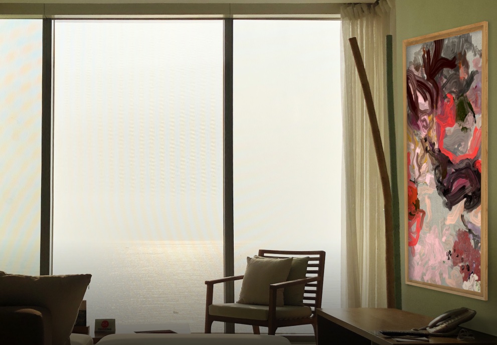
Not all screens are wide
We tend to think of screens as a wide rectangle, resting on a TV stand or hung on the wall, as a smaller version of the cinema screen or an upgraded version of the traditional landscape painting that decorated most homes, usually above the sofa. However, the landscape orientation screen, with its wide 16:9 aspect ratio, is a rather recent industry standard.
Manufacturers started producing 16:9 screens in the early 2000s, switching from the 4:3 aspect ratio that was common in most TV sets, following the growing popularity of high-definition television and widescreen content. Computers, laptops, and smartphones have adopted this standard aspect ratio, and later on, given the way we hold a smartphone in our hand, these devices have popularized portrait orientation content that is now ubiquitous on social media.
One might be quick to think that portrait screens are a result of the popularity of Instagram Stories and Tik Tok videos. In fact, when in 2020 Samsung launched The Sero, a 43-inch display that can rotate to adapt to vertical videos, it was widely seen as a response to the growing demand for a TV that would take mobile entertainment to the living room. However, portrait orientation screens have existed since the early days of computing.
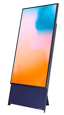
From A4 to TikTok
In 1989, Apple launched the Macintosh Portrait Display, a 15-inch vertical grayscale monitor designed to show full pages on a single screen. This was at the time that desktop publishing was taking off, and Apple saw an opportunity to attract creatives to its products and operating system. The portrait display could emulate an A4 sheet of paper, which was a very convenient feature for graphic designers, but also for anyone using a word processor –think of all the wasted space on the sides of your monitor and the constant scrolling you must do every time you write a text.
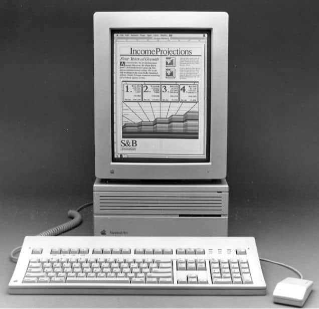
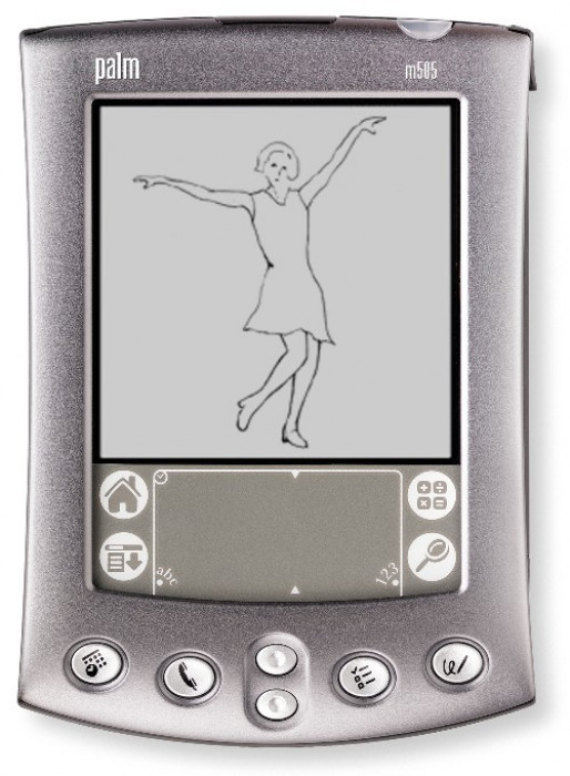
Despite the usefulness of this peculiar screen, the 4:3 aspect ratio of standard monitors became the norm, and soon the portrait display was forgotten. A decade later, TVs became wider and kept growing in size, but always maintaining the 9:16 aspect ratio that allowed for spectacular images and more immersive entertainment experiences. Notably, during this time (from the 1990s to late 2000s), portrait screens would still be used for handheld devices, as this format fits more naturally in the hand: Apple’s Message Pad from the Newton series and the Palm PDA are some of the devices that kept some users looking at (tiny) vertical displays.
By the end of the 2000s and early 2010s, e-readers, the iPhone, and the iPad had brought back portrait screens to regular use. At the same time, the rising popularity of social media took users to record their own videos with their smartphones, but some forgot to rotate them, producing 16:9 format content which at the time was mocked for being “wrong” – videos should be in landscape orientation!
Nevertheless, people kept making their “incorrect” videos, and in 2013 artist Aram Bartholl defended this user-generated content by presciently proclaiming: “The future is 9:16 vertical video!”
“Cities are vertical. Books are vertical. The whole Internet is vertical. All phones today are made to be used vertical. Mankind took millions of years to learn to walk on two feet!! Vertical video is the new standard and redefines the moving image.”
Aram Bartholl
Nowadays, the popularity of TikTok has led both social media platforms such as Facebook and Instagram and content and streaming platforms such as YouTube and Netflix to include vertical videos tailored for easy and quick consumption on smartphones. So it turns out that Bartholl was right.
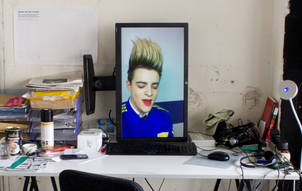
Digital art on a portrait screen
Artists working with digital media have long been interested in working with portrait screens as a way to distance their work from the content one might see on a TV or a computer screen. If a display in landscape orientation evokes cinema and entertainment, using it in portrait orientation can seem more “artistic”, similar to a painting. However, not all artists find themselves comfortable with a 16:9 space and prefer to work on a wide rectangle –more recently, NFT artists have reduced their canvas to a square, but that’s a matter to discuss elsewhere.
The 2010s saw an unprecedented development in the online art market and the launch of platforms and devices aimed at displaying, selling, and distributing digital art (Niio among them!). Several startups opted for manufacturing displays with an integrated computer commonly known as digital art frames. Some of them, such as *FRAMED and the now defunct Electric Objects, decided to produce screens that only allowed for portrait orientation artworks, seeking in the differentiating feature of the portrait format a way to identify their product as a display for art.
For artists working with digital media, the 9:16 aspect ratio is part of how they conceive a particular artwork. Most of them create works both in landscape and portrait orientation, depending on the type of composition or narrative they want to create.
Katie Torn, Dream Flower I (2021)
Katie Torn, a New York based artist who creates 3D animations about Internet culture and the self-image mediated by social media, works both on landscape and portrait format, favoring the latter when she wishes to portray one of her imaginary characters or totem-like mashups of “found” objects. She stresses the connection between the 9:16 aspect ratio and traditional formats used in painting and drawing, as well as the fact that using a portrait orientation screen was unusual just a decade ago:
“When I started making digital art I was drawn to working on pieces composed for portrait orientation because of its relationship to painting and portraiture. My work usually includes some sort of figure so it made sense to compose my video that way. Back then it was kind of awkward because portrait mode wasn’t used as often as it is now. It’s interesting to see how portrait mode has evolved over the last 10 years because of smartphones and apps like TikTok and now it dominates as the prime orientation we use to watch videos on our phones and the internet.”
Dream Flower I (2022), a work commissioned by Niio, is a good example of Torn’s use of the portrait format: a 3D animation that depicts a snoozing biomorphic female arrangement made out of flowers, leaves and pipes, it is a combination of portrait and still life, which takes inspiration from Victorian botanical illustrations. The aspect ratio reinforces the perception of this work as a portrait, evoking numerous artistic traditions, and therefore contributes to understand the animation as the artist intended.
Learn more about Katie Torn’s work in this exclusive interview published in Niio Editorial
Jonathan Monaghan, Panther Incensed II (2021)
Jonathan Monaghan is also an artist whose work helps us understand the specificities of the 9:16 aspect ratio. His 3D animations and prints, characterized by a detailed modeling of ostentatiously baroque architectures and mythological creatures, play with both landscape and portrait formats, presented in large projections or on screens with customized frames that integrate the display in the artwork as a unique object.
“I think screens in vertical format can really transform an ordinary display into a work of art and bring a unique presence to a space. It brings a more sculptural physicality to the artwork because it’s not how we ordinarily look at TV displays. I like working in portrait orientation as an artist because it helps me to get past standard narrative conventions and instead tell stories through just the imagery.”
Panther Incensed II (2021), a work commissioned by Niio, clearly exemplifies the artist’s intention to tell stories through the images alone. Based on an ancient legend, the animation depicts an encounter between a fantastic animal and a robot-like creature that reminds of the djinn or genie popularized in Arabian folk tales. Populated with references to baroque architecture and digital media, the work invites repeated contemplation, the portrait format reinforcing the spectacular scale of one of its main characters.
Learn more about Jonathan Monaghan’s work in this exclusive interview published in Niio Editorial
Why you should experience digital art on a portrait screen (besides a landscape one)
To conclude, here are some of the main reasons why it is worth hanging a screen of its side and using it to enjoy digital art:
- Portrait screens bring a unique presence to a space. They also relate to our perception of our own body when we are standing up, which creates a feeling of closeness.
- On a portrait screen, you have a more intuitive perception of a work of art.
- Vertical screens take less space and can dialogue with other artworks or elements on the wall in a more flexible way than landscape screens.
- Artists working with the 9:16 aspect ratio usually create a different kind of composition than they would in a landscape format. Experiencing these artworks helps discovering new aspects and nuances in their work.
- The portrait format can be constraining, but that also means that it is particularly interesting to discover how the artist has worked within these limitations.
- On a large screen, either hanging on the wall or placed on the floor, the experience of the artwork can be spectacular.
Niio has a large selection of artworks in portrait format and makes it really easy to set up your vertical screen. Just open your app, pair with the screen, and in the displays menu, select your screen and click on Settings > Display Settings > Appearance to configure the display rotation and other options.
We hope you enjoy exploring digital art on a portrait screen. While using Niio on your standard landscape screen will certainly be your first choice, we encourage you to try a vertical screen, even a small one, to experience art in a different way.
Don’t know where to start? Explore some of our favorite artworks on your portrait screen:
- Jonathan Monaghan, Starship Baroque II (2018)
- Katie Torn, Dream Flower II (2021)
- Fabio Catapano, Karmachromax V2 (2022)
- Yuge Zhou, To Afar the Water Flows (2015)
- Shi Zheng, Marvelous Cloud #1 (2022)
- Franz Rosati, LATENTSCAPE XV4A (2021)
- Domenico Barra, DB a̶r̶t̶ ̶c̶a̶n̶o̶n̶ | a̶ ̶b̶e̶a̶u̶t̶y̶ ̶i̶n̶ ̶v̶i̶o̶l̶e̶t̶ (2023)
- Antoine Schmitt, Cascade Grand Oblique Video Recording (2018)
