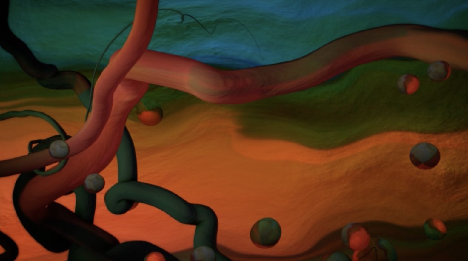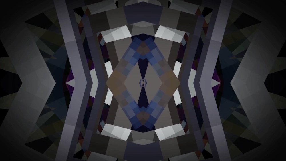
This article is the first of a series about the symbolism of colors based on the writings of historian Michel Pastoreau. According to Pastoreau, in terms of their symbolism and adoption by human societies, we can only speak of six colors: blue, red, white, yellow, green, and black. Taking inspiration from his texts, we have curated six artcasts that show how artists use these colors in their work and exemplify the ways in which they are incorporated into digital art.
We invite you to learn more about the symbolic connotations of each color and experience the artworks on your own screen.
Blue is the color that makes the perfect background. It doesn’t stand out, it is calming and invites consensus. Large organizations choose blue to denote sobriety and group consensus, as can be seen in the flags of the United Nations and the European Union. It is the color of the sea and the sky: a peaceful, quiet, conservative color. Pastoreau states: “since about 1890, blue became the prominent color in Western societies, as much in France as in Sicily, in the United States and New Zealand […] In other cultures something different happens: most Japanese, for instance, prefer black.”
However, blue has not always had these connotations. In ancient Rome, it was the color of the barbarians, the foreigners. There wasn’t a name for blue, which had to be borrowed from the Germanic blau or the Arabic azraq. In the 12th and 13th centuries, blue gained popularity in Europe thanks to the cult of the Virgin Mary, and was later adopted by royal families. In the 16th century, the Reformation promoted the idea that certain colors were more decent than others: black, grey, and blue became associated with correctness and adopted in masculine garments.
The invention of Prussian blue in 1720 popularized darker tones that were quickly adopted by Romantic painters and poets. In 1850, the Jewish tailor Levi-Strauss invented jeans, an indigo-colored trousers which introduced blue to the workspace, and later became associated with leisure, in the 1930s, and even a sign of a rebellious attitude, in the 1960s. Nowadays, blue is mostly perceived as a calm, conservative color, particularly in politics, as a reaction to the prominence of red in the communist regimes of the Soviet Union and China.
Patrick Tresset. Scene 11, Human Study #1, Hong Kong series, 2022
In the realm of the digital image, blue has acquired very different connotations: it can be electric, vibrant, an outlandish blue that can only exist in the virtual world. In 1993, Mosaic, one of the first web browsers, introduced blue hyperlinks to differentiate clickable text in addition to underscoring, which Tim Berners-Lee had introduced in his first browser in 1987. Standing out on the white, light gray, and yellow backgrounds of early browsers, blue became the color of the Internet in the 1990s. It has since been routinely adopted by tech companies, both for its association with electricity and machinery as for its dual conservative and rebellious symbolism. Leading social media platforms Facebook, Twitter, and LinkedIn use blue in their logos, denoting seriousness, consensus, and stability (although these words do not particularly apply to the current state of platforms such as Twitter). Blue has become the color of online communities, and even alternative channels such as Discord, Signal, or Telegram all use blue in their brands.
The chroma key compositing technique used in film to combine two or more elements recorded separately initially used black or white backgrounds, until in the 1930s RKO Radio Pictures introduced the blue screen method. The Thief of Bagdad (1940), which won the Academy Award for Best Special Effects, was the first film to use this technique. Blue has since been used, alongside green, as a background in film sets, and therefore associated with visual effects, and particularly science fiction blockbuster films such as Star Wars.
The popularization of cyberpunk, a literary genre that responds to the utopian science fiction stories of the 1950s, brought a darker shade of blue to our visions of the future. Ridley Scott’s 1982 film Blade Runner, an adaptation of Philip K. Dick’s novel Do Androids Dream of Electric Sheep? (1968), pictured a dystopian future in a dark and rainy city of Los Angeles dominated by immense screens and neon lights. In William Gibson’s Neuromancer (1984), the sky is blue gray, “the color of television, tuned to a dead channel.” Blue has thus been associated with technology, science fiction, and virtual worlds since the 1980s and 1990s. It was partly replaced by the popularity of phosphor green, associated with hacker culture and popularized by films such as The Matrix trilogy (1999-2003), but was brought back by a wave of 1990s nostalgia exemplified in the work of Post-Internet artists in the early 2010s.
Alix Desaubliaux. Alexandra Erlich-Speiser, 2021
Nowadays, blue is used in digital art in the same way as in painting, to denote melancholy or to represent a blue sky or a calm sea, but also as a distinct color of virtual worlds and to symbolize artificiality. Blue continues to be a conformist, calm color, but in our digital society it has also become associated with connectivity, ubiquity, and community.
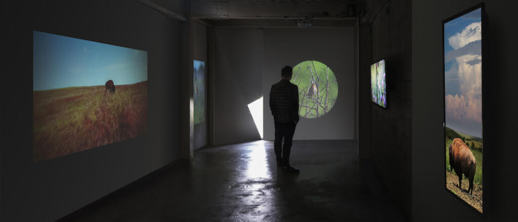
Artist and researcher Aaron M. Higgins holds BFA and MFA degrees from The Henry Radford Hope School of Fine Art at Indiana University. Higgins delves into time-based media as an artistic medium, employing lens-oriented capture methods, digital layering processes, and interactivity. His artwork has been showcased both within the U.S., including cities like Chicago, Cincinnati, and New York, and abroad, with features in Korea, Sweden, and the Netherlands among others.
Higgins recently presented the solo artcast Memory Palaceson Niio, featuring a series of artworks in which the artist draws inspiration from microscopic images of the human brain, as well as those taken by the Hubble Space Telescope, to create alluring, surreal landscapes. In the following conversation, he reflects on the relationship between his digital media work and his background in painting, as well as his connection to landscape and nature.
Bring Aaron Higgins’ mnemonic landscapes to your screen
You have a background in painting prior to your digital media practice. How did you move from one medium to the other, and how does your knowledge about painting inform your digital work, which is at times deliberately painterly?
My undergraduate studies were in Painting, and my graduate studies focused on Digital Media. I found working with Digital Media somewhat intuitive and picked things up relatively quickly. I think my strengths lie in how I compose and composite imagery in my work. A lot of this is similar to how I think about composing a 2D rectangle, but with time-based media I am also considering how the composition moves and changes over its timeline. As with a drawing or painting, I consider how the eye might move around the image, or how space is constructed within the composition of the image. I also want something for the eye to sense, or feel, as it relates to the surface, so I think a lot about visual texture, and compositing methods that yield a ‘painterly’ quality. I guess in some ways I am trying to work against the sanitization of the screen-based image. In the same vein, I am also subverting the ‘digital’, or ‘machine’, and attempting to reimplement ‘the hand’.
There is an interest in landscape in your work, from the documentary-style images of Tallgrass to the surreal environments of Mnemonic Passages. What do you find in landscapes that is interesting for your work?
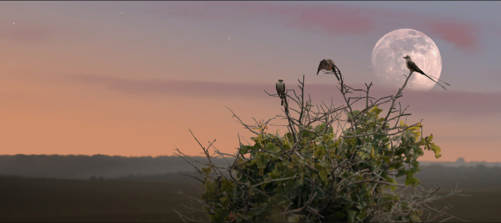
The landscape has it all. I try to maintain a connection to the landscape, in my life and in my work, although it’s not necessarily front of mind. Most of my earlier work, painting, focused on painting in the landscape, as well as still-life, which I also think of as landscape. I’ve always been fascinated by nature, after all, we emerged from mother nature. To me, there is something spiritual in connecting with and observing nature, of being immersed in the landscape. The landscape can be so many things, a prairie, a memory, a body, a mind, etc. In my early interactive works, the Splitting Time series, I suppose that I am thinking of time, and the image itself (what the camera sees), as a landscape and reorganizing its pieces into abstract compositions. In a sense, everything is a landscape of sorts.
Since the landscape is a cultural construct, as Alain Roger has suggested, which roles do fiction and narrative play in your landscapes?
That’s an interesting question. As I mentioned in my previous answer, the landscape holds endless metaphoric possibilities. The landscape often serves as a placeholder for something else. In many ways we project our own values, ideals, and biases on the landscape before us. Artists do the same in their work, and the viewer does the same in experiencing the work. I try to leave room for this to occur. In the Tallgrass series, for example, the work is representative of my experience in the tallgrass prairie landscape. I want to share that dynamic, interactive experience with the viewer. In doing so, however, I am weaving a lot of fiction. The imagery is highly composited, creating something other than reality. Maybe a collage of reality… creating an ideal, but there is also a more universal narrative that is superimposed on the work transcending any information gathering, documentation, or individual experience.
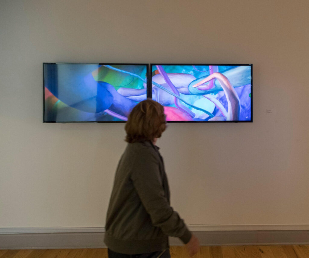
In the Mnemonic Passages series, the imagery is completely invented, but I use actual video in my compositing process. In this series, particularly, I am using webcam footage of myself (working on things in front of my computer) as textures that wrap the 3D forms (memoryforms). This adds the hint of subjective imagery inside, or across the surface of these forms. It also helps to create a sense that these forms are flickering with information. In this way, as with other works of mine, there is an element of self-portraiture to my work as well as landscape.
Regardless, the process usually involves taking photo imagery and creating something ‘new’ with it.
Aaron Higgins. MemoryForm (1), 2017
In the Mnemonic Passages series, you depict memory palaces as organic, and somewhat otherworldly spaces instead of the rational, neo classical buildings we are used to imagine. What drove you to choose this type of image?
With the Mnemonic Passages series, I suppose I am really thinking of the memory palace as the mind. I was thinking of the biology of the brain, the intricate architecture of neurons and synapses, etc. But, also as a place, a landscape, where memories are stored. These memories take form and shape within our minds, building the landscape of our experience. Of course, as I say in my statement, I am inspired by imagery from the scientific research and study of the brain, but also imagery from the research and study of our cosmos. The cosmos might be a ‘superlandscape’, if you will, that I see as a metaphor for our mind, or accumulated experience and knowledge. As our experience and knowledge grows, so does our picture and understanding of our cosmos.
Where does your interest in memory stem from?
I guess my interest in memory stems from ideas related to your previous question. Our memory and experience, our culture (a form of generational memory) forms our identity. Like culture, a memory is a living thing that can change, bits are added, bits are taken out, we fill in missing bits to keep the landscape (trying to be consistent with my metaphors, here) cohesive and making sense. Neuroscience is also very relevant these days with new groundbreaking discoveries in how our minds work seemingly happening all the time. The same could be said about the cosmos and what we are learning from the James Webb Space Telescope. We are literally looking back in time at the earliest galaxies that formed in our universe, amazing stuff.
Aaron Higgins. MemoryForm (2), 2017
You speak of creating meditative experiences through works that you patiently build layer by layer. How important is that meditative aspect in the making of the artwork, as your own experience, and then in the final result, as the experience of the viewer?
I really believe the work and craft that goes into something adds to what is communicated to the viewer and their experience. Craftsmanship is an important part of the process, always. One of things I love about painting is how meditative the act of painting is. There’s a lot that I find similar in my creative process with Digital Media. For one thing, the work evolves over time, and you have to be open to those changes. An idea I start out with is not always the same as what I end up with. I, too, evolve and change throughout the process and find that my interests lead me in new directions. The work sometimes has a will of its own, too, it seems, whether it be the nature of the tools, or limitations of the software or hardware (or myself), it always seems to be a negotiated process. Beyond that, choices are made as things progress that depend on what has happened up until that point, until the work is resolved. I try not to labor too much on these choices and let the work tell me what to do, if that makes any sense, and being in an open, meditative state tends to help with this process. It can be a challenge, though, when your computer crashes, or render times get unbearably slow.
As far as the viewer experience, I guess I am sort of imposing my preferences and communicating what I want my work to be in how I present it. However, I do want the work to be disarming, calming, and perhaps to create a sense of wonder and awe. When I think of my time-based work, I often think of paintings, as we discussed. I think of viewing a painting as something that happens over time. The painting is always on, always there to be received. As it is experienced and one is immersed, the more that is discovered, it changes. The context within which a work is experienced also has an effect on the experience. Is it on a screen, a phone or a television, is it projected? In what space is it, a private or public space? I try to apply these ideas to the presentation and structure of my time-based work. All of my work seamlessly loops and is always on, there is no beginning or end. It is there to be experienced at viewer discretion, for 30 seconds, 10 minutes, or an hour, or more. It’s there when you want it, for as long as you want it. In that sense, I do not want the work to be annoying or overbearing. I want it to be tolerable, I guess, not seizure inducing.
Yet, I also don’t want the viewer to ignore the work, I want them to be engaged. I don’t want to impose too many parameters on the viewer or make it a chore to experience the work. In this sense, I think a lot about control, and the relationship between artist and viewer, viewer and art, etc.
Control then becomes a subject I explore as it relates to life, my experience, the creative process, etc. I try not to exert too much control, especially on things that are out of my control. I know I’m getting in the weeds here… But, I guess, this goes back to the landscape, haha… and the process having its own sort of evolution that involves the artist and the media and letting that process occur without too much interference. I want to afford the viewer the same opportunity in how they experience the work.
To quote Caroline Lavoie, from an article titled, ‘Sketching the Landscape: Exploring a Sense of Place’, “An object or person does not exist in isolation, but through relationships with its context. These relationships support a necessary state of being…”.
Tough question.
Aaron Higgins. Mnemonic Passage, 2017
You have expressed your interest in incorporating the viewer into your work, through interactive installations. How would you compare your interactive work with your films and animations in terms of their concept, production process, expectations, and outcome?
So, I think, picking up where we left off in the last question… I am interested in introducing more randomness and perhaps an element of surprise to my work and how others experience it. Something that is always on, and loops endlessly, runs the risk of becoming monotonous. Adding some randomness and unpredictability can thwart the monotony, and keep viewers engaged. This also speaks to the landscape, self-portrait concepts, as well as the viewer/art/artist relationship, and how things change over time.
In the ‘Tallgrass’ series, for example, the viewer would trigger events in the landscape: lightning striking, the sun setting, moon rising, bird calls, different poses and movements, etc. For each scene, a clip from a library of audio clips with variations of bird calls could randomly be paired with a video sequence of a bird singing. Motion sensing cameras trigger events as viewers move through the space. This adds slight variation and randomness in experiencing the work, so that experiencing the work again would almost certainly be different in variation and sequence of events. To me, this more closely resembles my experience in the tallgrass prairie, where things are the same, but different each time I visit.
My life experience, my interrupted or failed plans, my unexpected successes and victories, all the predictable and unpredictable events… This sort of ‘passive interaction’, allowed in ideas of control vs chaos which made the work feel more alive and real to me. Back to the prairie, when I would hike in the prairie and see an animal, they didn’t act as though I wasn’t there, they responded to my presence.
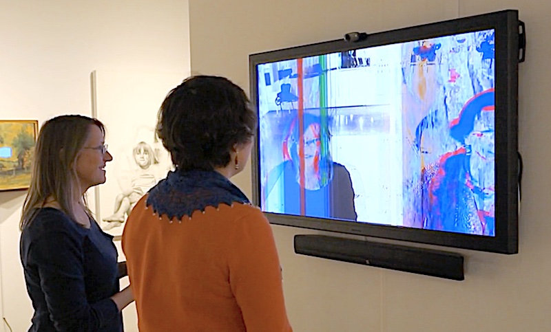
In turn, this extends to the viewer, who in some cases was literally incorporated into the work, i.e. Karmic_Lapse, and altered the work by viewing it. As it relates to the artist/viewer relationship, the work is completed upon experiencing. That is to say, work is meant to be shared with and received by a viewer, an audience. That is when a work comes alive, not in my mind, but the mind of the viewer. We can relate this back to the Lavoie quote, “an object (or person) does not exist in isolation, but through relationships with its context.”
In relation to your code-based work, you speak of a “collaboration” with the software. How do you balance control and randomness in these projects, and what would you say that you have learned from the machine?
I enjoy how these questions are threaded together, these are really good questions. First, I am not much of a coder, but I use After Effects java-based expressions, visual coding languages- connecting inputs to outputs, I used to use actionscript, that sort of thing. To answer your question, though, the machine, its operating system runs on code, the software runs on code, I implement code, etc. It’s all doing things for me, in a sense. I mean, I tell it what to do, but I don’t completely understand how it’s doing it. So, in that way it is a collaboration, I guess. But, as far as balancing control and randomness, there are serendipitous things that occur throughout the creative process. I try to let these things occur, even push the process, the machine, to catalyze their occurrence. These are moments where something unexpected, something random occurs that adds to the piece. There’s a lot of experimentation involved, trial and error, but it’s a sort of dance seeing where things go and knowing when you’ve gone too far. This applies to painting, as well, there are some tools, like the palette knife, that can offer great control, but also, if used in a certain way, can create randomness in the application of paint to the surface. It further removes ‘the hand’, so to speak.
I’m not sure what I’ve learned from the machine. It’s constantly changing. It’s a great tool and allows for infinite possibilities. But it can get old, too… Sometimes I feel that things have been homogenized to a degree, and things all start looking the same. I see a lot of that in AI art, especially. I guess my background in more traditional media is keeping me grounded, somewhat, and I am not quite ready to let the machine take over.
DISØRDINARY BƏAUTYis an ongoing art project byDomenico Barrathat explores ugliness through glitch art. The project has been developed as a series of NFTs, with a new phase taking place on Niio as a work in progress, in which the artist will periodically upload new artworks and accompanying documentation. Here in the Editorial section, we are publishing email exchanges bringing light into Domenico’s creative process and the ideas and influences behind this project.
Follow Domenico Barra’s work in progress on your screen in DISØRDINARY BƏAUTY: art canon
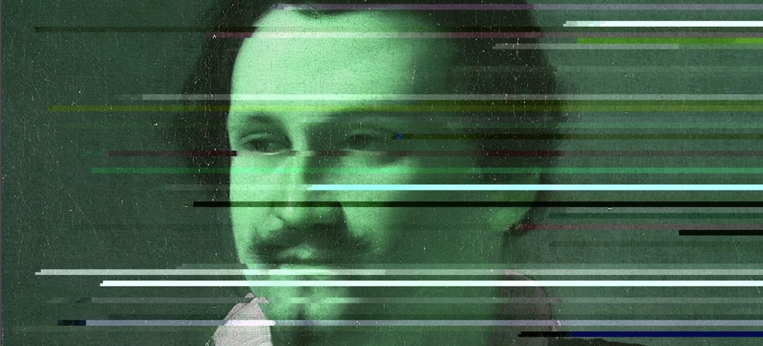
Domenico Barra, DB a̶r̶t̶ ̶c̶a̶n̶o̶n̶ | p̶o̶r̶t̶r̶a̶i̶t̶_̶g̶e̶n̶t̶l̶e̶m̶a̶n̶, 2023
Third ɛʍǟɨʟ exchange
from: Pau Waelder to: Domenico Barra date: Jul 26, 2023, 6:46 PM subject: Re: Disordinary Beauty #03 on Niio
Hi, Domenico!
Again, work piles up and it is hard to keep up with everything!
I hope summer is going well despite the heatwaves, Barbenheimer and the overall craziness of the world (including the disorienting change of Twitter to X, is this the end of times?).
Ok, so I have a couple more questions (in attachment) that came to mind after watching your latest artwork, I hope you find them interesting.
Looking forward to your answers, take care and best wishes!
Pau
from: Domenico Barra to: Pau Waelder date: Jul 31, 2023, 4:43 PM subject: Re: Disordinary Beauty #03 on Niio
Dear Pau,
We live in a society that demands us to be always busy even when we have nothing to do. We are online crafting content to SHARE we are not doing anything. We never take a break from doing, just for the sake of having always something to SHARE, it’s crazy. I think doing nothing is an act of rebellion. I am spending at least one hour per day on the reef by the sea only staring at the horizon.
I am glad you had the chance to have some quality free time, and I am happy it feels great. Creativity runs wild during those moments. Make sure you will have more of that, you won’t regret it.
Here below are my answers to your questions. I hope you will find interesting thoughts for your piece.
I wish you well and I look forward to reading your next email.
Sincerely,
d0/\/\!
This time we have a portrait by Caravaggio, no less. Some would say that using the work of such a great master is disrespectful, or that you might be using his fame to draw attention to your work. This also brings to mind the availability of these artworks in the public domain, for everyone to use, which is also our right, and the artists’ right, to build on the legacy of the culture we have inherited. How would you respond to this?
In the realm of the public domain, a critical landscape emerges, particularly in the era of AI-generated images and the resurgence of artists reclaiming their copyrights against the proliferation of their styles through text-to-image AI systems. While the focus here does not revolve around a living artist, one cannot ignore that those who might perceive my reinterpretation of Caravaggio’s work as disrespectful could be driven by a similar sentiment. “Do not copy other artists, if you are a real artist you should create your style signature”.
Read about the Electronic Frontier Foundation‘s take on Copyright and AI art
Drawing from a background deeply rooted in remix culture, I wholeheartedly support the open access to cultural content, advocating for its use to create something innovative and as a means of paying tribute and preserving legacies. This commitment forms the basis of my series, exclusively created for Niio, where my aim is to shed light on lesser-known artists and their works, fostering art literacy and cultural appreciation. As I did in this video where I picked a not so famous work by the Italian Great Master. My art strives to serve a cultural purpose, akin to remix culture, by presenting novel perspectives and reimagining traditional artworks. I make it a point to provide additional files and content alongside my creations on Niio, enabling people to download, use, and remix them.
In this particular video featuring Caravaggio’s work “Portrait of a gentleman” (presumably Scipione Borghese), I intend to pay homage to the artist and his legendary narrative and legacy. My roots in Naples, Italy, and my current residence in Malta strengthen my connection to Caravaggio, whose presence has been an integral part of my cultural upbringing and daily life. The three masterpieces located in Napoli, namely “The Flagellation of Christ” at the Museo Nazionale di Capodimonte, “The Seven Works of Mercy” at Pio Monte della Misericordia, and “The Martyrdom of Saint Ursula” at Palazzo Piacentini, hold a special place of pride in my city’s history. These pieces have been an essential part of my childhood memories, instilling a sense of artistic bong and cultural appreciation. Upon moving to Malta, one of my first actions was to visit Caravaggio’s works, “The Beheading of St. John the Baptist” and “St. Jerome,” at the Oratory of the Co-Cathedral of St. John in Valletta. Their presence in my new home further deepened my connection to the artist.
In creating my art, I do not seek to copy Caravaggio’s style or exploit his fame and name. Rather, I endeavor to pay tribute not only to Caravaggio but also to other artists who have left a lasting impact on the art world. My series, titled DISØRDINARY BƏAUTY | a̶r̶t̶ ̶c̶a̶n̶o̶n̶s̶, showcases artworks that, in my opinion, stand out within their respective canons, either through their classical nature or innovative approach. Much like Caravaggio revolutionized art with his masterful use of Chiaroscuro, I aspire to bring fresh perspectives and novel experiences to the realm of art. I am humbled by the inspiration drawn from Caravaggio’s artistic persona, while fully acknowledging that I am not comparing myself to his immense talent.
Embracing the principles of open access, be it Public Domain, Creative Commons, Copyleft, or copy-it-right, I firmly believe that such practices foster a healthier and more inclusive cultural environment. By encouraging accessibility to artistic and cultural content, we contribute to the richness of our collective heritage and enable a broader audience to engage with and appreciate art in its various forms.
Since a glitch is perceived as an error, some might understand glitch art as just randomly distorting the source material, without real agency in the outcome. But I see a methodical work and some aesthetic decisions. Can you take us through the process you have carried out to create this glitched portrait of Scipione Borghese?
The conventional perception of glitch = error has resulted in numerous misconceptions and misunderstandings of Glitch Art. However, this has also led to diverse artistic interpretations, hindering the establishment of a precise technical definition for Glitch Art, something I believe it kind of resulted into an opportunity for artists to explore different meanings and stories.
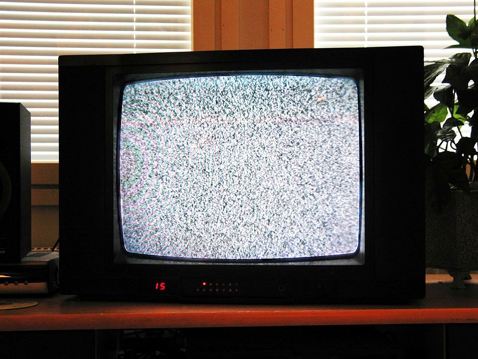
Notably, the lack of a direct translation for “glitch” in Italian and many other languages further adds complexity to its understanding. Instead, terms like “rumore” in Italian and “ruido” in Spanish were suggested, words mostly associated with sound, rather than visual anomalies. I still recall my grandmother calling me to check her TV because there was some rumore on the screen.
To rectify these misconceptions and align those with my glitch art experience, I emphasize in my classes and art presentations that glitches are not errors as if they were errors, we would have nothing as the machine would stop working; glitches are unexpected events, anomalies arising from deviations in standard functions, and instances where machines misbehave. These glitches can even be deliberately induced forcing the machine into glitching defying expectations and programmed exhibiting a level of controllability, while others emerge organically in the wild digital landscape. In post-production, we have the freedom to craft and edit our glitches as desired, opting for “natural glitches” or controlled variants, depending on their role within the semiotics of the artwork.
In my current series for Niio, I adopt a dual approach, incorporating both databending and generative glitches. In the case of databending, I allow the glitches to unfold spontaneously, experimenting with various formats and video codecs, curating the most potent ones for later use in post-production. While I maintain some degree of control over these glitches, their behavior often surprises me, as different codecs interact distinctively due to variations in data arrangement standards. Conversely, generative glitches grant me more control; I can determine their appearance, speed, and intensity by modifying the script’s values.
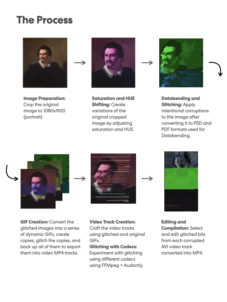
Creating each video segment exclusive to Niio in this series is a labor-intensive process, involving a dizzying cycle of coding and decoding, transitioning from one format to another, combining databending and generative glitching, rendering, and finally editing. For “DB a̶r̶t̶ ̶c̶a̶n̶o̶n̶ | p̶o̶r̶t̶r̶a̶i̶t̶_̶g̶e̶n̶t̶l̶e̶m̶a̶n̶” after Caravaggio, I opted for an even more challenging path. Initially, I rendered the original image in diverse hues and saturations, saving each frame for use in a gif. Subsequently, I glitched this gif using a hexadecimal software named Notepad ++. Both the unaltered and glitched gifs were then imported into a couple of generative glitch apps running in Processing and JAVA, where I live recorded some of the generative processes and effects, later glitching a few outcomes using Notepad ++.
The video editing process for this artwork involved integrating approximately seven to eight gifs at this first stage of editing. One of this GIFs features an upward-breaking effect, the one you suggested is reminiscent of Francis Bacon’s style, achieved through generative means. To add further complexity, I introduced another glitch cycle by combining the original image and its various HUE versions in a PDF file with JPG encoding, subsequently glitching the PDF files using Databending in Notepad ++. Through this intricate process, I generated around 90 images, each then rendered into more gifs for additional Databending and generative glitching in Processing, yielding a considerable array of gifs for the final video editing.
Some of these files are available for download on Niio, and I have utilized them on social media to showcase the work in progress and announce the video’s release. The complexity of this process is a testament to the dedication and creativity poured into my glitch art, striving to challenge conventions and push artistic boundaries within the contemporary context.
A package of 14 files from the editing process is freely available to download from the artwork’s page on Niio.
Borghese was a famous collector, and supporter of Caravaggio and many other artists, who helped introduce the Baroque style in Italy. Was his role as an influential individual in the arts what led you to choose this portrait? It certainly does not depict a classical form of beauty, as the previous artworks in this series, but rather an image of power. How would you contextualize this work in your research on the canon of beauty?
In our society, few things are as captivating as the allure of power. The pursuit of a public and esteemed image of power becomes an undeniable canon to conform to, one that can elevate our perceived beauty in the eyes of the world. My decision to delve into this subject was motivated by various factors. Traditionally, portraits have centered around classic subjects such as muses (as seen inDB a̶r̶t̶ ̶c̶a̶n̶o̶n̶ | a̶ ̶b̶e̶a̶u̶t̶y̶ ̶i̶n̶ ̶v̶i̶o̶l̶e̶t̶ after Paul Quinsac) and self-portraits (explored in DB a̶r̶t̶ ̶c̶a̶n̶o̶n̶ | s̶e̶l̶f̶-̶p̶o̶r̶t̶r̶a̶i̶t̶ after Carl Joseph Begas). However, with this third artwork, I aim to shift the focus towards collectors.
Collectors, though often playing a quieter role in the art world show, have now risen to prominence, especially since the mainstream emergence of NFTs. In the digital art renaissance, they have become the true stars, the esteemed patrons fueling this transformative movement. Everyone, including myself with a diverse collection of digital art on blockchain platforms like Tezos, Near, and Ethereum, has embraced the role of a collector.
NFTs have transformed the digital art domain into an intricate role-playing game, where anonymity through nicknames adds an element of playfulness. We witness figures like Cozomo de Medici and the entire Medici dynasty virtually ruling the Web3 digital art arena. Here, the term “ruling” is not used lightly, as money, and by extension, wealth and influence which embody power, find particular significance within this game.
Collectors have become the darlings of admiration, and collecting itself has evolved into a means of garnering adoration and building influential networks and status within the digital art scene Web3 industry, social media circles and various communities. It is an avenue to monetize one’s social and digital art capital. This work, DB a̶r̶t̶ ̶c̶a̶n̶o̶n̶ | p̶o̶r̶t̶r̶a̶i̶t̶_̶g̶e̶n̶t̶l̶e̶m̶a̶n̶ after Caravaggio, delves into the realm of art portraiture as a potent symbol of power, it delves into the captivating allure of power collectors have and the fascination it holds for us, reflecting the beauty and allure we attribute to those in positions of authority.
Drawing upon my experiences in Napoli, where several years ago I encountered two captivating exhibitions at the Museo di Capodimonte, the very same museum housing a Caravaggio masterpiece, I found myself immersed in the world of portraiture. The exhibitions titled Tiziano e il ritratto di corte da Raffaello ai Carracci featuring portraiture works by Tiziano and V.I.P. – Very Important Portraits featuring works by David LaChapelle provided a thought-provoking discourse on power, fame, and wealth, illustrating how these themes were portrayed through contemporary artistic aesthetics and the canons of their respective eras. These exhibitions deeply influenced my decision to explore the realm of portraits in several of my projects and collections.
The selection of this specific work by Caravaggio was intentional, as it stands as a less popular piece by the Italian master. In this painting, Caravaggio exhibits a more conservative approach, juxtaposed with the often rebellious nature he is famous for, especially when it came to choosing the models for his painting scenes where he often preferred to pick common people from the streets. Here he conceded to some compromise and adhered to a more traditional style, and the subject of his portrait is nonetheless his patron, depicted in all of his authority and prestige. In my work I also disrupt that image, pushing its features to the extreme.
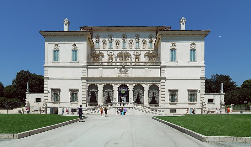
Lastly, I have cherished the captivating moments spent in Villa Borghese during my time in Rome, indulging in the tranquility of warm summer nights and immersing myself in the Borghese’s park, Collection and Museum. These places have had a profound impact on me as an art lover. Villa Borghese’s ambience exudes the essence of art’s beauty and power like few other places, leaving an indelible mark on my artistic journey.
This work shines as a tribute to art collecting, a praise to visionary collectors, and also a mockery of power and portrait as a temple of power, let’s say.
Japanese videographer Yusuke Shigeta (1981) has developed a body of work consisting of screen-based and multimedia installations for art exhibitions and museum shows. A Graduate from the Tokyo Graduate School of Film and New Media, he works in animation and has recently become involved in the NFT market, where he finds an additional channel of distribution for his work.
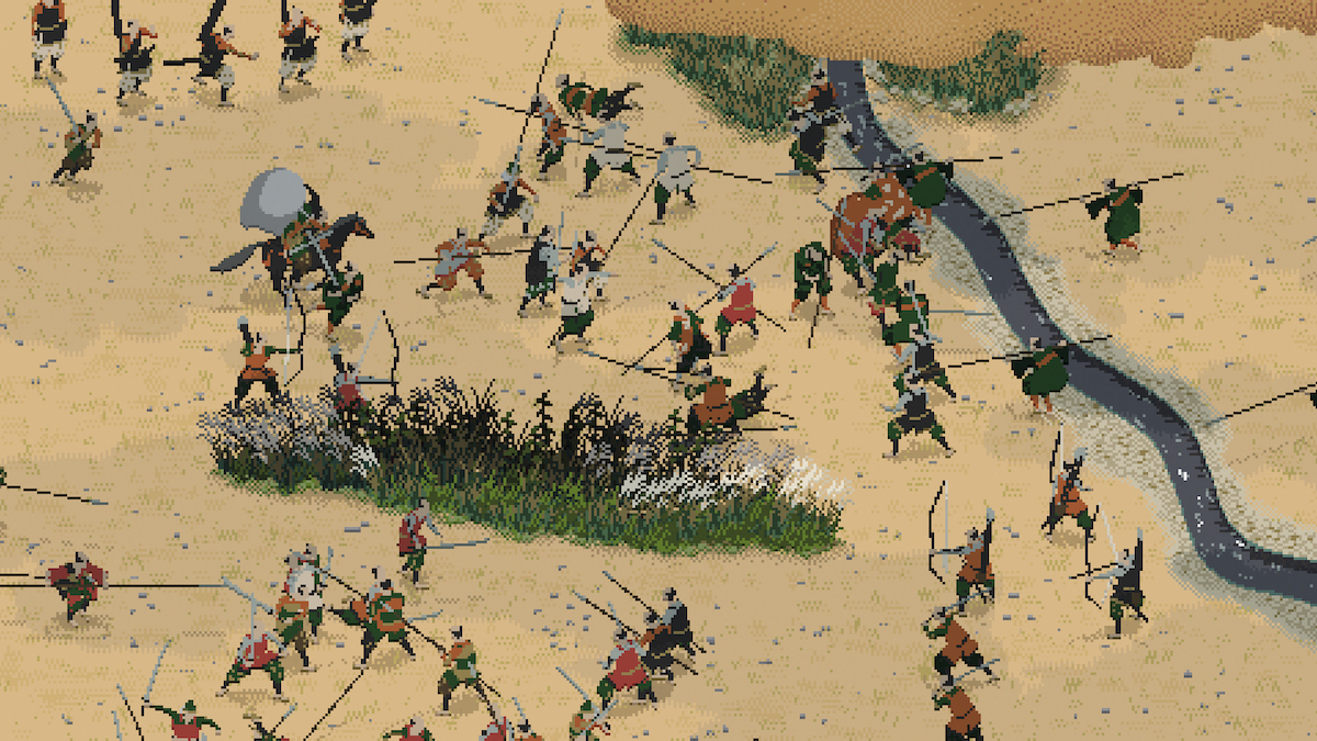
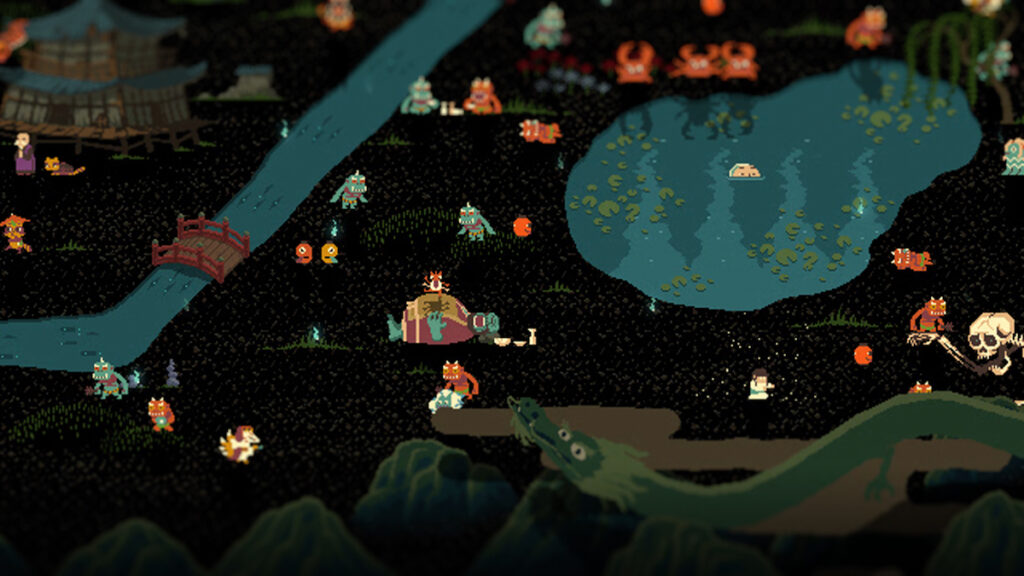
His animations are characterized by the exploration of pixel art, with the depiction of complex scenes in the style of low-resolution graphics that became popular with video games in the 1980s. Far from simply using an aesthetic that has been revived in opposition to the dominance of hyperrealism in digital imagery, Shigeta explores pixel art as a form of finding new visual experiences in a world saturated with images. He connects this digital technique with the history of image-making, reinterpreting traditional Japanese paintings in painstakingly detailed animations (despite their pixelated look) that are as imaginative as they are respectful to the source material.
The artist recently presented on Niio a selection of his latest work under the title Pixel Landscapes. In this exclusive interview, he explains his interest in pixel art, traditional painting, and cultural influences in our globalized society.
You have expressed your interest in working with pixel art from your memories playing with the Nintendo Entertainment System (popularly known as Famicom) in the 1980s. Would you say that the pixelated graphics from this time gave more room to imagination than current high resolution 3D graphics?
I was indeed born in 1980, and I belong to a generation that was greatly influenced by the Nintendo Family Computer (Famicom) during my childhood. Many pixel art artists also have a background in gaming. However, I personally didn’t have a particularly strong interest in games. Of course, I consider games to be a highly influential and significant cultural medium in the present era of expression. Nevertheless, the reason I started creating pixel art was merely a coincidental choice while experimenting with various artistic techniques.
I hold great respect for the pixel techniques nurtured within gaming culture and have learned a lot from producing pixel art. However, I see my work as reconstructing pixel art in a context distinct from games, expanding it into new forms of expression.
Considering the nature of expression, I believe it’s crucial to think about the differences between 3D computer graphics (3DCG) and pixel art. Much of 3DCG aims to replicate photographic techniques and, more fundamentally, the functioning of the retina. On the other hand, pixel art is closer to primitive paintings or symbols. The 20th century witnessed an exploration of optical visual experiences through photography, cinema, and 3DCG, but now we are starting to feel a sense of stagnation. I believe that alternative visual expressions can provide us with new possibilities for visual experiences.
It is commonly said that pixel art is “cute.” Would you say it is cute because it is imperfect? How does this “cuteness” come into play in your work, for instance when depicting a historic battle or a scene from daily life?
I believe the reason for the “cuteness” of pixel art lies in its “sense of size.” Pixel art feels cute because it appears small. However, this is quite peculiar because digital images do not possess a physical size. Whether an image is considered large or small depends on its content. A whale would be considered large, while an ant would be considered small. So why does pixel art evoke a sense of smallness?
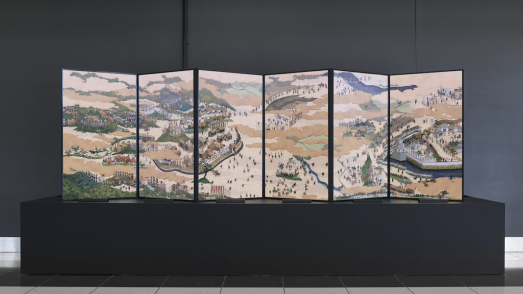
I think it’s because of the lack of detail. When humans create something very small, the size of the tools or hands comes into play, inevitably resulting in less intricate details. Therefore, when we encounter pixel art with reduced detail, we intuitively perceive it as something small. Although pixel art is a pure digital form, we perceive a sense of materiality in it. That’s why I believe pieces like my Sekigahara-Sansui-zu-Byobu exude a kind of exquisite beauty akin to delicate craftsmanship.
In your pixel art animations based on traditional Japanese paintings, how much do you replicate from an original composition and how much do you create on your own? Do you feel constrained by the traditional norms of composition or does the use of pixel art liberate you to create according to your own rules?
When basing my artwork on traditional Japanese paintings, I adjust the layout to fit the screen, add elements, and sometimes make minor edits. However, my primary objective is to faithfully and modernly reinterpret the original artwork. Beyond the artwork itself, I gather various literature to research the historical background, actual landscapes, and surrounding ideologies of the depicted era. As Japanese people, we modernized significantly through Westernization, becoming an advanced nation. Therefore, exploring the Eastern classical way of thinking in the present offers a rather fresh experience.
There is creativity involved in translating traditional art into pixel art from a technical perspective, but there is also the fascination of rediscovering lost Eastern ideologies and interpreting them in a contemporary context. I am of the opinion that engaging with Eastern classics through my creative work is a highly stimulating process, providing me with numerous insights and ideas. Furthermore, I believe it enriches the viewer’s experience by establishing a connection between the viewer and classical art.
The Tatsuta Road animation was created for the Kashiwara City History Museum. Can you tell me a bit more about this commission? How does the pixel art reinterpretation of traditional painted scrolls bring the history and aesthetics of this art form closer to a present day audience?
This artwork is in a traditional Japanese painting style, but there were no original illustrations available. It was created based on partial illustrations and texts, with supervision from history experts.
In the modern world, academic disciplines have become specialized and fragmented, but originally, knowledge was a comprehensive system. While specialization is unavoidable for the precision of academic pursuits, I find this approach somewhat restrictive. Personally, I appreciate the old notion of comprehensive knowledge, where different fields stimulate each other. Aesthetics, in particular, has the potential to connect various disciplines and can provide us with new inspirations.
Sekigahara-Sansui-zu-Byobu is exhibited as a “folding screen” made of several digital screens. With its combination of history and traditional and digital art making techniques, it seems a perfect embodiment of Japanese culture. Can you tell me more about this work and how it has been received? Was it challenging to reproduce the original work, applying crowd simulation techniques?
Sekigahara-Sansui-zu-Byobu is currently on permanent display at the Sekigahara Battlefield Memorial Museum. Until 2022, Japan hosted an international media art event called the “Agency for Cultural Affairs Media Arts Festival,” where my work received recognition. This led me to join the “CULTURE GATE to JAPAN” cultural promotion project. In 2021, several media artists were invited to create works based on the traditional cultures of different regions in Japan, with the plan to exhibit these works at Japanese international airports to connect with inbound tourists. Unfortunately, the project couldn’t fully achieve its goals due to the pandemic’s impact. However, “Sekigahara-Sansui-zu-Byobu” received significant attention from both domestic and international audiences, especially through social media. The creation of the “Tatsuta Road Kamenose Picture Scroll” was inspired by the Sekigahara article, and currently, I am working on another “Sekigahara-Byobu” commissioned by the Sekigahara Battlefield Memorial Museum.
Furthermore, in this artwork, I used HOUDINI software for crowd simulation, employing it in an entirely unprecedented manner, which gained recognition at HOUDINI conferences and SIGGRAPH. Collaborating with a specialized team, who are also a collective of media artists, was essential for the production using HOUDINI. The background for this connection can be traced back to the “JAPAN MEDIA ARTS FESTIVAL” mentioned at the beginning.
Yusuke Shigeta. A Shore A.M./ P.M., 2021
A Shore AM/PM is a totally different type of animation that focuses on daily life in the present day and the passing of time. Can you tell me how this work came to be and how you chose the setting and the scenes that are part of it?
A Shore A.M./P.M. is a series depicting the landscapes of the town where I live. I have been living here for almost 10 years and have always wanted to create pixel art of this place because I truly love it. However, most of my previous art presentations were in physical spaces such as galleries and museums, and I ended up producing many large-scale installation works. Amidst this, the pandemic emerged, leading to the cancellation of many exhibitions that relied on in-person interactions. Simultaneously, the rise of NFTs prompted me to start working on a series of animation pieces focused on online showcasing.
In this artwork, I experimented with pixel art techniques that involve depicting familiar landscapes, creating variations with changes in time, and utilizing multiple resolutions while maintaining the same composition. It was intriguing to see the reactions on social media, where many people recognized the scenes as their own town. Some even connected with distant memories they had forgotten. The abstracted pixel art has the power to evoke the landscapes of the viewers’ own memories.
Your work often involves installations with large projections, immersive environments and playful interactions with visitors. How do you conceive your work in terms of the space and of the interaction with viewers?
Many video works incorporate a temporal development known as “exposition, rising action, climax, and resolution.” However, when these works are projected in exhibition spaces, the narrative design doesn’t always function seamlessly. This is because many viewers may join in and start watching from different points in the sequence. To address this, I focus on designing the overall temporal experience of the artwork. Sometimes, I embed various playful elements within looped videos or include gradual unfolding of events. As the progression of the experience depends on the viewers themselves, I believe creating artworks that actively engage the audience is crucial. In that regard, pixel art with its “cuteness” and “room for imagination” proves to be highly effective in accomplishing this goal.
Your screen-based work can be presented in large projections, installations, folding digital screens, and also via streaming on any screen now on Niio. What do you think about this flexibility in displaying your work and reaching new audiences?
I studied graphic design in my undergraduate program at university. After that, I joined an animation company and later pursued a graduate program in media arts. Currently, I am involved in various areas, such as pixel art, NFT, and teaching at an oil painting university. I believe this diverse career path truly represents who I am, and I still feel like everything is happening in parallel. I have faith that the new worlds and people I encounter will always provide me with fresh inspiration.
Learn more about Shigeta’s work in this video interview by Toco Toco
Kaya Hacaloğlu (Ankara, Republic of Türkiye, 1975) is an artist who works in video and photography, experimenting with live cinema, documentary, and video painting in individual projects and collaborations with other artists and creators, combining video with literature, poetry, music, painting, and performance. With a group of artists he developed the projects Mugwump and Cotton AV, consisting of live cinema performances combining found footage with electro/acoustic and atmospheric music. His work has been exhibited in international art festivals and biennials in Istanbul, Zurich, Rio de Janeiro, Berlin and many other cities.
Hacaloğlu recently presented on Niio the series Pensive Tree, a photographic project that merges images from a plane tree standing at the entrance of the Süleymaniye Mosque in Istanbul and a madrone tree in Austin, Texas into an ever-changing, flowing abstract composition that evokes multiple states of matter. Hacaloğlu chose the term Agâh to describe this morphing shape, a word that in Turkish and other languages means “aware,” or “knowledgeable.” In the following interview, he discusses his video and live performance work, the making of Pensive Tree and the inspiration he has drawn from legendary filmmakers.
Kaya Hacaloğlu. Pensive Tree Fluffy Tissue / Agah, 2022
Your background is in cinema studies. How has the cinematic narrative influenced your work? What has driven your transition towards abstract or semi-abstract works and to video paintings?
The cinematic narrative gave me a taste, an ability, and an interest to comprehend a ‘language’ which comes with a long history of collective creation. It opened a door which influenced me to get together with other cinephiles and people of interest in creating work.
I regard cinema as a containing medium.
The quintessential auteur who has made the leap from cinema to the lands of deconstructing his own visual narrative films and projecting them in rooms and cisterns would be Peter Greenaway, whose techniques and abilities are particularly influenced by art history and classical paintings. Other filmmakers that have profoundly influenced me are Chris Marker, Derek Jarman, and Jean-Luc Godard. Marker’s approach into making a film, for instance La Jeteé, is made of a series of still photographs as opposed to filming them with a film camera by taking 25 photographs a second. He therefore plays with the sense of motion in film (although motion appears one time and only briefly at a certain point in the film.) Marker started in the movement of Cinema Verité, which takes video journalism approaches to everyday street life in Paris. Godard’s and Anne-Marie Miéville’s ways of editing and implementing found footage, archival images, sounds, music and narration, add a sense of belonging and nostalgia to the cinematic narrative, connected to a certain moment of the history of the 20th century. Jarman’s methods of multi-layer editing using video-synthesizer and his experimental approach into dance, queer cinema and his brave character have made him a landmark in Cinema culture. And of course Guy Debord and his slogan “le monde a été déjà filmé, il s’agit maintenant de le transformer:” The world is already filmed, it is time to change it. All of which I believe belongs to the tradition of filming and projecting that is part of the influences of cinema in my work.
Working a little bit at the University’s local television station channel 2 and watching displays of student works of the video art department’s ASTV is what drove me to study cinema and later take video classes at the Art School. The works I have come up with during my first years of learning were not exactly abstract works, at least the ones which got completed, but planned-constructed scripted works which were made in the university’s facilities. These works were very structural with usage of intellectual property. My transition from the realm of cinema into studies of non-narrative video making came after a work I have made mixing super8 and miniDV footage through the use of my digital NLE station at home in 2001.
In your video work one sees an attention to everyday life but also experiments with overlaying of images that lead to quasi abstract compositions, particularly Cotton AV which seems to be a precursor of the series we now show on Niio. Can you explain the process behind Cotton AV? How would you say this work relates to Pensive Tree?
Cotton AV and its precursor Mugwump were made, as you say, by combining materials taped by Ozan Akıncı and myself and materials from public archives and footage from movies. Clips were created, looped in the most perfect possible way which were later fed to a software running on a laptop connected to a projector. By the time we started Mugwump none of us owned a laptop, and as the music was also live: there was a band of two musicians on stage, Şevket Akıncı and Korhan Erel, and a vocalist. We recorded the finished material on a DVD and connected a DVD player to the projector. As the band was playing live, starting and pausing at a certain time was crucial to keep the music synchronized with the images, which we had to do manually. We played mainly on a theater stage in Galata called Perform. Ozan got himself a laptop and as I was already used to being on stage and feeding loops, downloading loads of materials through eMule for my VJ mentor Exiled Surfer, we started using a software called Grid quite quickly. As we moved on I had a laptop and a V4 Edirol video mixer and were able to cut and fade between each other’s machines and mixes. Cotton AV had its last show at VJFest in 2012 organized by Burcu Gündüz, and ended after having performed with Gevende.
Cotton AV and Pensive Tree may seem to be connected but are in fact quite different in their production and concept. Cotton AV is a group performing live on stage, whose visuals are created on-the-fly and whether or not they are being recorded they are just like live-music, which means they will never repeat themselves the exact same way but have been improvised. Pensive Tree is a series of works. Each work is a continuing display which starts and ends. And is not necessarily a loop. It is not a collaboration but made during a different time, in the presence of Leyla Atavi who was there as both a muse and an inspiration, she is a graphic designer.
I first saw Framed digital art at a coffee shop in Moscow in the year 2010 at the commemoration of the famous poet Nazım Hikmet as we were performing with the team that created Mugwump. The screens were as big as iPads and were framed. Various softwares were also coming along and methods of projections in clubs especially had moved along which were tiresome, at times. I had an idea of using a screen as a mirror and implementing algorithms to create effects similar to those on Instagram, but that didn’t progress. By the time I started working on Pensive Tree I found people who created their own software, used RasberryPi microcontrollers and provided complete instructions on woodcutting and fitting a monitor into a frame for displaying still or digital video. There have been previous encounters such as the famous fireplace video which I first saw in Switzerland.
Your photography work is strongly inspired by nature and also plays with textures and blurs to deconstruct the image and suggest a painterly composition. Which is your approach to photography? How does it relate to your video work?
Photography is a containing medium, an archive of a certain moment a fragment of a place in time. It has a natal relation with reality. It is made to replicate what the camera is seeing, thus what one eye is seeing is shaped to be seen and interpreted by many. I think of it as a womb which contains the infant prior to giving birth and where its child comes into encounter with light, as the most extreme example one can give as its relation to reality. As being begotten with the source of light. Just as, in some eastern cultures it is treated so sacredly. My brother during his trips to the Far East told me of some people who wouldn’t let him take their pictures as they thought their souls would be stolen. My relation with the camera and especially the question with the subject has somehow become an ethical matter, and questions about quasi experiencing the present, the happening has led me to nature and visual compositions.
I do not have a certain approach in photography. Looking and capturing is a certain skill which has to do with the correlation in respect to the human senses and the refinement of the experience and the person who experiences. The subject behind the works in the Pensive Tree is a photograph of a tree. The essence is a photograph started progressing through circular motion, and advanced its way with changes of the image’s pixel points and alterations in the duration and colors of the pixels that gave its textural and blurry forms and painterly character through the utilization of computer software.
Kaya Hacaloğlu. Pensive Tree Dervishes Adrift / Agah, 2022
You have collaborated with different artists, including writers, poets, musicians, and performers. Can you describe these collaborations? How have they contributed to shaping your artistic practice and the subjects you address?
The collaborations helped me to enhance my skills in editing and shaped my personal approach to the creation of later works. They have given inspiration and also reasons and responsibilities. It would have been impossible for most of the underground or non-mainstream works in Türkiye to be made if it was not for the sense of solidarity and companionship here in Türkiye.
An example of a collaboration I would like to give is from a performance that I have organized for the ending and closure of the first screenings of the works of Pensive tree. The exhibition took place in 2019 at the Taksim Art Gallery, an ancient water cistern, as part of the Istanbul International Art Biennial. The renowned Istanbul Biennial, which is sponsored by the municipality, features the work of numerous artists, mainly in the form of painting, sculpture, photography, fabric art, and installations. The new Taksim Mosque was being newly built right across the Ataturk Opera House. The closing performance consisted of guitar player Şevket Akıncı, musician Özün Usta who improvised music and artist Eymen Aktel who painted on a canvas while I was projecting or mixing works of the Pensive Tree series. A line I wrote, “I hug where you stand out, in the shadow of what is called admiration, I rest.” was read by Eymen who improvised spoken word along the show.
Can you tell us about the video and digital art scene in Türkiye? What is it like, how has it evolved in recent years given the growing presence of art fairs and international events?
The video art scene started with a few people many years ago who voluntarily curated artists who had limited ways of displaying their works. This was before Youtube. I would recall VideoIst, and other collections such as Turkish Delight by Genco Gülan and other camps back in the 2000’s where shooting and editing video was taught and required collective work such as Barış için Sinema (Cinema for Peace.)
Displaying digital video requires expensive display equipment like a Digital Panel or a Digital Projection. Along the years many organizations with panels with artists and curators, and solo shows the scene has made its peak I would say with the help of sponsorship. Many Turkish artists are in the international arena. Mappings, public projections to historical monuments and the usage of ancient spaces are being organized for exhibiting digital artwork.
Your work is present in several online digital art platforms. What is your experience with the digital art market? Which opportunities and challenges do you see in the way art is distributed and commercialized nowadays?
My experience with the digital art market is due to the medium’s properties, the ownership, “re-production,” and maintenance of the artist’s rights of the “original” artwork. It is a challenge for the art market to introduce digital artworks as there is a strong competition from “static” artworks such paintings and sculptures. But I believe the growing acceptance of digital art is coming through large installations in public spaces, and not only in ticketed entry shows. The main issues for the future of digital art, in my view, are the accessibility to the artworks, the fairness in remuneration for artists, and of course that the art is properly presented.
Digital art can be treated as wall art or framed art now and it is making its way into homes. I remember one platform which displays the works of painters throughout the history of art on a vertically mounted ‘television’ and this example only can show us how much it has evolved throughout the history of print making.
The opportunity is for the art is to be visible. The invention of NFT granted the digital artwork an ‘original’ status because of its copying properties being hundred percent undetectable, a digital artwork becoming a digital token marks it as valuable.
The issue for the artist is to have their work exhibited and recognized. The way digital art can be distributed is already here, it is a technical matter for it to be installed and displayed almost anywhere. The challenge is how will it be creating a revenue for the artist and how will the preservation of the work be possible. Is it ok for some works to be available publicly or do they belong to private institutions, as video art has been treated and distributed as videotapes or film?
Canadian artist Stuart Ward has been inspired by ancient cultures since his childhood, and by a pragmatic approach to art making that had him incorporate digital tools into his traditional arts education. Living in Tokyo, he joined the live VJ scene in the mid 2000s and began collaborating with musicians, dancers, performers, and visual artists. Returning to Canada in 2010, he started an experiential design studio, working with internationally recognized brands such as Porsche, Cadillac, Lyft, TED, Asics, and Heineken.
His experience in both the traditional art world and the advertising and design fields shapes his perception of art as a form of creative expression that transcends boundaries and communicates with an audience on any possible context: not just in the white cube of the gallery or museum, but also on media façades, projections and screens in private and public spaces.
MUEO is the chosen name for his visual art persona and a creative project that references from Greek and Roman sculpture, Baroque architecture, treatises on visual perception, advertising, and the neon lights of the streets of Tokyo. On the occasion of his solo artcast Mueo – The Initiation, we talked about his work and the topics it explores.
Take MUEO’s Neo-Baroque compositions to your screen
How would you describe the way Greek and Roman iconography, as well as that of other traditions, such as Buddhism for instance, is being incorporated into our contemporary culture, e.g. as a symbol of power or authority, or to express refinement? How does this apply to your work?
Greek and Roman architecture was adopted by several powerful nations and used as a symbol to perpetuate their power through association. Some of those nations ended up leaning more towards fascism, others went entirely that way. Cultural symbols have been permanently ruined in parts of the world. Architecture of power and dominance being built today has since shifted to the opposite end of the spectrum while simultaneously holding on to Greek and Roman forms. It’s almost as though the powerful are seizing both ends of the spectrum. There is a lot of nasty brutality in history, everywhere in the world. Learning about it is a great start to avoiding repeating it.
Simultaneously, the possibility of greater expression has roots in freedom, so within the brutality of history, moments of divine inspiration have occurred, possibly through extended peace and periods of abundance. There is now more art being made than ever before, as humans have access to tools of creation like never before. The color blue used to be a symbol of immense wealth. Now we can buy it by the gallon.
Buddhism is an interesting one. Their recruitment tools are more elegant and sophisticated, but they have recruitment. It is interesting to consider who they are appealing to. The aesthetics associated with Buddhism seem to also be universally associated with spirituality and lack the association of power and dominance that has been added to the spiritual or religious expressions of Europe. I’m paying attention to symbols in my work, as I recognize the power they carry.
Stuart Ward, Neptune, 2023
In your work we can see references to cycles of death and rebirth, and the connection between the divine and eternity, that are expressed in a visually attractive form. How would you say these concepts of constant changes and cycles speak to our consumption of cultural products, and of cultural trends?
I try to avoid politics before whisky, but there’s an idea by an awful political theorist that makes a lot of sense when removed from the rest of the context of his work. He said that people should express themselves by what they create, not by what they consume. I think most people’s creative expression comes through consumption. How they dress, the music they listen to, the food they eat. One thing that I’ve noticed that makes me uncomfortable is that sometimes after binging on a bunch of interesting and creative content on social media, I feel like I myself have been participatory in the creative process. This is far from accurate, but the feeling has existed, and I wonder if that non-productive creative moment is the reward for most people?
It might also be worth mentioning in the digital art scene, as NFTs emerged, everyone was so excited to break down the existing system and start anew, but within a few months, the existing systems had re-emerged, or the community was unknowingly asking for its return. Curators and critics reappeared. Blue Chip artists in the digital space became a thing. Now the digital scene is an established system waiting for its next interruption.
You point out that you are interested in a Neo-Baroque aesthetic and in seeing what is possible to do with decorative forms when their material limitations have been removed. What drove your attention to these decorative forms in the beginning?
Where did these decorative forms emerge from? I know that some forms come from nature, like a dried acanthus leaf, or a fiddlehead fern, but the forms have evolved an almost musical quality. They so beautifully match the music of the era, wherein a form goes one way, and satisfyingly at just the right location, it spins and curls off in a different direction. We like music because it does what we expect, and we like it even more when it does what we didn’t expect, and subsequently brings us back around into what we expect again. Without the restriction of gravity or construction materials, what is the end evolution of those whirling swirling decorative forms? I think the mystery and curiosity to explore those questions drove me towards working with them in my art. That, and my early childhood home had several pieces of furniture with decorative swirls that I’d get lost in while playing, so there may be some deep memories of early childhood surfacing.
Stuart Ward, Artemis, 2023
In the artworks we see on Niio the elements of Baroque architecture create a frame around the main character, but in other works such as Ecstatic Angel and Transformation at the Gates of Eternity, which feature sculptures by Bernini, the architecture dwarfs the sculpture and becomes the main element in the composition. How do you conceive the balance between the two: sculpture and architecture, figure and frame?
Good question. I see them merging to become part of a singular experience where the architectural details and the sculptural details become a cohesive whole. This is part of the effort to explore the forms without physical limits. They can occupy similar values. Beyond that, in the Bernini piece for example, if it were to take a more dominant role in terms of scale in relation to the rest of the artwork, I’d feel a sense of unease. The sculpture is iconic and stands alone as an artwork. Is a great photograph of the sculpture also an artwork? Sure. I guess. But it runs dangerously close to losing its artness and becoming just a photograph. I feel similarly about a 3D rendering of a sculpture. Yes, I posed it in a scene. Yes, I organized a virtual camera, and created a lighting system, and a material system, but it’s still at the edge of art, in my valuation of things. Perhaps my system of values is more strict than others, but I felt like to make the artwork a deeper expression of my own work while simultaneously referring to the greatness of Bernini’s sculpture, the surrounding artwork needed to occupy more space visually and thematically.
Your choice of colors is quite characteristic of a type of aesthetic that has become popular in NFT communities. Have you been inspired by other creators in these communities? What do the colors bring to these compositions in relation to the references to Greek and Roman sculpture, and Baroque architecture?
My artwork series from 2021 was more ‘classical’ in its color range, in comparison to Baroque artwork. In late 2021 I moved to Tokyo, again. The neon and lights of the big city had an influence on my aesthetic, and the works made in 2022 evolved to have luminous neon shapes and glowing effects. I think part of the purpose of it was to progress in the arms race against creative stagnation, and to challenge myself to express in a new aesthetic.
To further discuss colour for a minute, I’m a big fan of magenta. It’s my favourite color, despite not being a color on the electromagnetic spectrum. I was working with a lighting expert several years ago planning some lighting projections for an event. They told me that using warm colours like orange, yellow, and pink will make the audience under the lights look healthy and the event will be more fun and better received, as opposed to an event lit with too much blue and green, making people look unhealthy. I think of that, and use magenta’s contrasting colors with consideration.
Aqua/teal expands into the possibility of color. Before synthetic pigments arrived on the scene, some colours were rarely available for use. Despite the sky being blue, blue pigments were expensive and rare, as were purples, which is the reason for their association with royalty. The arrival of spring and the blooming of flowers in the pre-synthetic colour era meant that colours would be visible, having almost entirely disappeared to nearly everyone for the winter, the exception being the blue sky, always out of reach. Coincidentally, blue leds were the most difficult coloured lights to engineer: there were a few decades where led screens were yellow, orange, red and green. Now, the entire world can access as much colour as they want without restriction, but perhaps we have a deep memory of life before that unlimited access, and give brightly coloured things a sense of special attention. It could also be linked to an earlier structure of foraging for colourful fruits and berries. The concept is interesting to mentally explore.
You speak of creating moments of elation and wonder with your artworks. Would you say that the use of a symmetrical composition, the cyclical movement of the different elements, and the rhythm of the animation are all intended to create a mesmerizing effect?
My work intends to express the possibility of there being more to the universe than we can perceive with our senses. This is generally objectively true in that right now we can’t sense the multitude of wifi and cellular signals flowing through our bodies. But further to that, more deeply universal questions about the possibility of a soul or spirit within, or a sense of divinity. I’m careful with how to express this, because my artwork isn’t intended to be religious in its theme, but more to express a possibility of ‘more’ through myth, pattern, motion, and the emotional response that those tools create. There are two fantastic books, The Oxford Compendium of Optical Illusions, and Vision and Art; The Biology of Seeing. They look into what is happening in the eye and the brain while observing images, and how optical illusions trick our visual sense. I’ve been exploring how to use this in art to express a sense of mystery.
Stuart Ward, Ecstatic Dance 2, 2023
In your opinion, how have social media and motion graphics influenced digital art creators?
Social media has caused some harm. As a result of the trend of Dailies, artists are rushing to create work quickly in order to get something new to share every day. In the process of trying to accomplish that, we end up making simpler things, and exploring creative ideas that we’ve already proven to be a social media hit. So the artwork becomes a response to the high speed social feedback rather than taking time to really work on an idea and iterate on the work. I know, because I fell into the same traps.
I must also confess that a short loop is better for me, because the render time is shorter, and the reward centers are activated sooner in the creative process. Some of my loops are only 4 seconds long, despite seeming much longer due to their seamless quality. As I’ve moved further away from the ‘dailies’ style work, I’m more and more comfortable with longer content where some parts loop quickly while others take more time to reach their looping conclusion. But this is still content under 30s long.
Motion graphics add another tool to the artist’s creative capacity. The addition of motion to artworks adds to the capability of expression, but without proper media systems and hardware, it runs the risk of being forgotten, in favor of more physical media. It’s part of the reason why I’m excited to be working with NIIO: they facilitate the exhibition of motion enabled artwork in a progressive and intelligent way.
Your experience as a VJ and designer have surely taken you through different spheres of the visual arts, crossing the membrane between what is considered art and what is considered popular culture. What is your opinion on this separation? How can it be overcome in an age of art on screens and online distribution?
The barrier between art and pop culture has been largely broken down during my art career. Collaborating with a brand used to be considered ‘selling out’ and the only customers and revenue streams an artist should have was sales of art, and the non-art job that supported their practice in the likely event that it wasn’t sufficient. Now we see major artists collaborating with major brands, and it is seen as a part of ‘making it in the art world’.
Stuart Ward, Nymph, 2023
Murakami and Arsham immediately come to mind when it comes to successful collaborations wherein the artist retains control over their image and artwork, while also merging in a beautiful way with well known global brands. Perhaps this process was facilitated by luxury brands supporting the arts, like Fondation Louis Vuitton. The art world seems to have shifted again as NFTs rocketed into the scene. The digital art space was moving so quickly that the old guard couldn’t keep up, and the gatekeepers were left behind. Eventually, in the chaos, a new order emerged, and some artists who were not considered ‘real artists’, but mere ‘digital creators’ found themselves on the inside of the gates, selling work at globally renowned, established art auction houses. The system has restructured.